The love for the 1990s isn’t just the result of incredibly thick and heavily rose-tinted glasses. In truth, there’s a reason that so many people of a certain age crave the entertainment of that era, and it’s because the shows really were of an insanely high quality.
While the 80s has its own army of fans, it’s hard to continue to enjoy the original Transformers animated series, or even GI Joe, as they are blatant toy commercials with little-to-no meaningful content. Fast forward to Beast Wars, the '90s version of Transformers, and kids were not only given a toy commercial, but a genuine sci-fi show with incredible character arcs and moments of intense, memorable emotion.
Then there were the Nicktoons like Doug, Hey Arnold, Rugrats and more. These shows told stories that kids could relate to, but adults could also fully enjoy.In fact, it seems like most of the beloved animated fare of the 90s existed to tell real stories and create entertainment that didn’t talk down to its audience, with Batman: TAS as a prime example.
Aside from advances in storytelling, the other thing nearly every show of the era had going for it were bold and distinct designs. Unlike the uniformity of cartoons from the past, a multitude of 90s series had unconventional looks that separated them from the pack, and in our list, we’re taking a look at radical new takes on these iconic designs by longtime fans.
Here are the 25 Crazy Fan Redesigns Of Iconic '90s Cartoon Characters Better Than What We Got.
25 Captain Planet
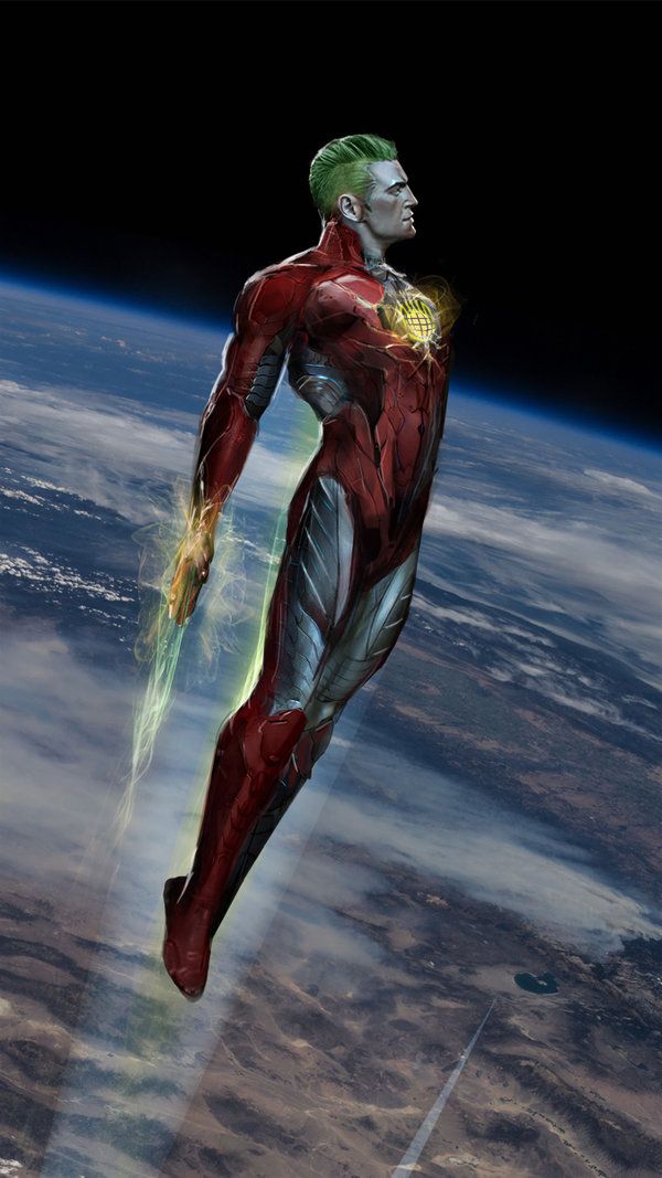
In retrospect, Captain Planet was an incredibly weird show. Five kids are given magic rings that, with their forces combined, were able to summon a magical superhero called Captain Planet who went to battle against pollution.
The show is lower-end '90s fare, but this redesign by uncannyknack shows us what a modern take on this icon could be like.
With inspiration from Iron Man, this modernized Captain Planet looks like he’s ready to wage total war for supremacy against the polluters across the globe, and we’d love to see it happen.
24 Kablam!
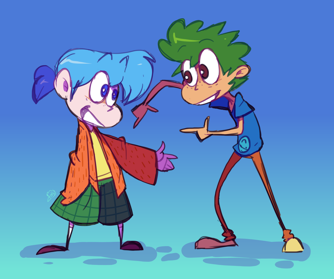
Kablam! was one of Nickelodeon’s weirdest shows, which is really saying something considering the fact that the network prided itself by pouring an unknown green substance on anyone and anything. A collection of often surreal shorts like “Prometheus and Bob,” “Life With Loopy” and the truly uncomfortable “Action League NOW!,” the series was hosted by Henry and June, two incredibly strange-looking (and acting) kids.
Though their style was unique, Allister's version is an excellent refinement, and does quite a bit to whet our appetite for the long-awaited return of the duo, their Big Foot companion, cavemen, aliens, action figures, and the rest of the absolute chaos that was Kablam!
23 ReBoot
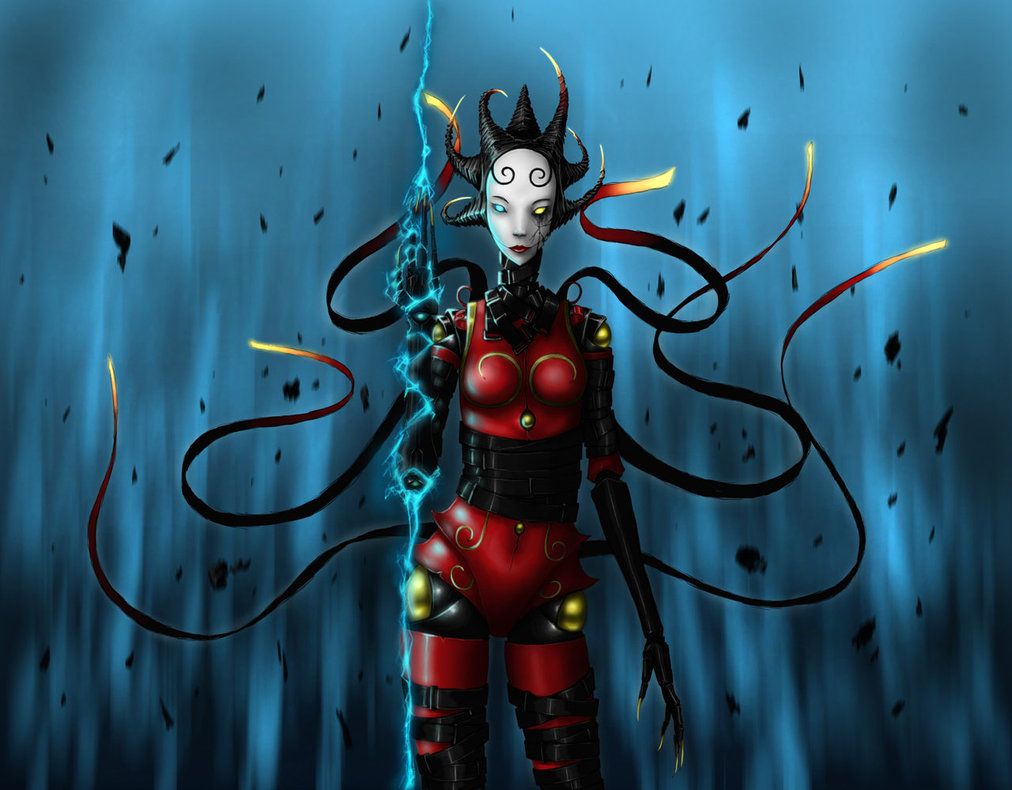
The progenitor of fully-CGI animation for episodic television, ReBoot started off as a wacky story about life inside of a computer, with the main hero, Bob, being a Guardian (essentially an anti-virus program) defending his city, Mainframe, against the resident viral infections Megabyte and Hexidecimal.
Here, BlackTar-in-a-Jar has taken Hexidecimal, tossed aside her early-CGI look, and given her a wicked makeover that would look fantastic in motion.
Here’s to hoping that this design is considered for the next ReBoot reboot, once the awful Guardian Code is laid to rest, permanently.
22 Batman: TAS
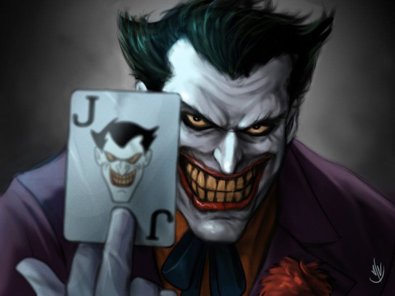
There was nothing like Batman: The Animated Series when it premiered during the '90s. Opting for each episode to be akin to a “mini-movie,” the bleak tone of the series was bolstered by incredibly strong writing and performances, along with a truly bold and distinctive art design.
Somewhere between blocky and sleek, and then thrust into an Art Deco world, the character designs remain impressive to this day. Jaeon009 wanted to try something a little different with the look, though, and opted to give the iconic Joker a realistic makeover. The result is nothing short of outstanding.
21 Biker Mice From Mars
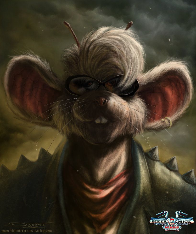
Every now and then, kids of the 90s will be hit with a fragment of a memory that leaves them questioning whether the bizarre scenario that just bounced around their head was a figment of their imagination or something that actually happened. Biker Mice From Mars is the latter.
A trio of, you guessed it, biker mice from Mars waged war against the Plutarkians, and defend their adopted home of Earth in the process.
The artist, AtomiccircuS, has taken Throttle, the gang’s leader, and given him a realistic makeover that far surpasses the cheap look of the original series.
20 Rugrats
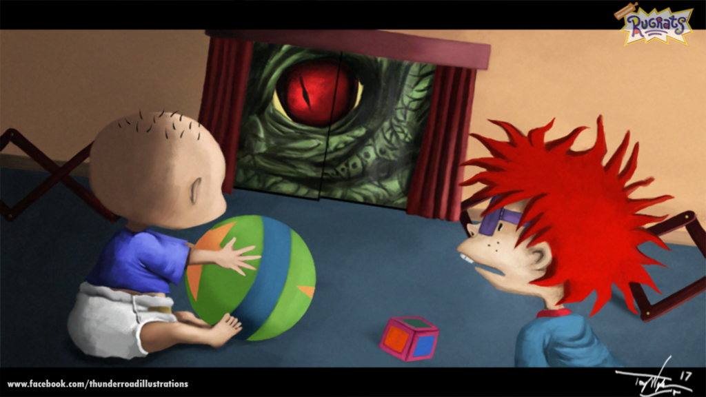
The production company Klasky Csupo was responsible for some of Nickelodeon’s most prolific Nicktoons, including Aaahh!!! Real Monsters, The Wild Thornberrys, Rocket Power and As Told By Ginger. Most importantly, though, was their hand in Rugrats.
With an art design that’s often been described as “ugly,” each of the company’s series certainly had a unique look, and we love what Splashguy has done to the beloved and iconic Rugrats. The original designs are retained, but given a more artistic veneer, with a rich palette, tangible texture and excellent shading. And it looks absolutely awesome.
19 Powerpuff Girls
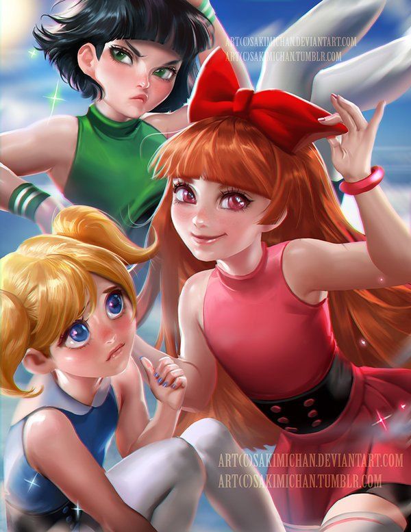
While Nickelodeon was certainly a stalwart fixture of 90s animation, Cartoon Network had more than a few classics running as well, not the least of which was the Powerpuff Girls. Following the exploits of three kindergarten-aged superheroines, the show had a huge following and was recently rebooted for modern audiences.
Regardless of the version, the series has always had a unique look that combined heavy outlines, and enjoyed the clashing of sharp angles and rounded aesthetics.
Sakimichan tossed aside the old look and gives us a mixture of realism and anime, and we have to admit that it looks utterly stellar.
18 Tiny Toon Adventures
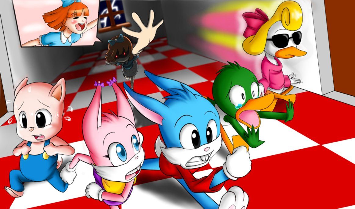
Tiny Toon Adventures was a great addition to the legendary Looney Tunes franchise, and the perfect introduction for kids to the wacky humor the originals were known for.The show followed the exploits of the descendents of the Looney Tunes as they attended school to learn how to be… well, loony toons.
The show’s look is classic '90s, but artist QuesoGr7 updates the main cast perfectly. Combining an anime aesthetic with sleeker designs and an overall cleaner look, their take on the series is fantastic, and it makes us want to see these designs in motion.
17 Recess
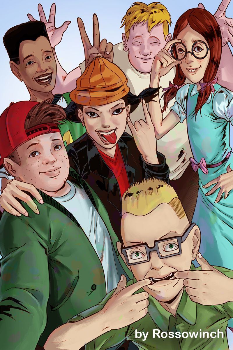
While Fox Kids, Nickelodeon and Cartoon Network were the unquestionable juggernauts of 90s cartoons, Disney was not going to let itself fall behind.
Among a slew of reasonable hits, Recess emerged as a clear winner when compared to its peers, and the show remains as charming and funny today as it did when it premiered.
Artist RossoWinch took the iconic cast, gave them a slightly more realistic aesthetic, but retained their core elements and charm, creating a great new take on the series, but remaining faithful to the original in the process.
16 Daria
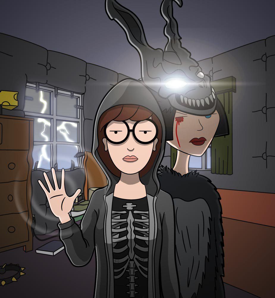
A spin-off from Beavis and Butt-Head, Daria tells the story teenage girl offering subversive observations of her life and the world around her. The show’s aesthetic is already iconic and bold, but this artist decided to take things a step further with their redesign.
Despite Daria’s popularity at the time, it’s still considered to be a cult-favorite, so it makes sense that S-C would pair Daria and her friend Jane with Donnie Darko, another cult-favorite. While the changes to Daria’s original style are subtle at best, the merging of the film’s look and Daria’s aesthetics makes this an excellent and unreal piece.
15 Doug
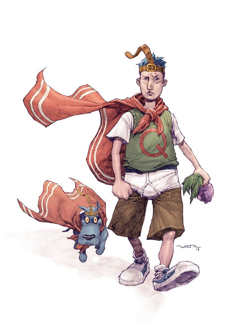
The very first Nicktoon, Doug gives us a glimpse into the incredibly average life of a newcomer to the town of Bluffington, but despite the seemingly bland premise, viewers were treated to countless tales of genuine, which cemented Doug’s place in the hearts of many a '90s kid.
While the original, simple and sleek designs of Doug and his friends are excellent on their own right, the artist fwatanabe took what made those designs work so well and added a fresh layer of life to them.
Certainly far more fleshed out than the original aesthetic, we get a chance to a see a Doug who maintains his core features, but has far more depth.
14 Ed, Edd 'N Eddy
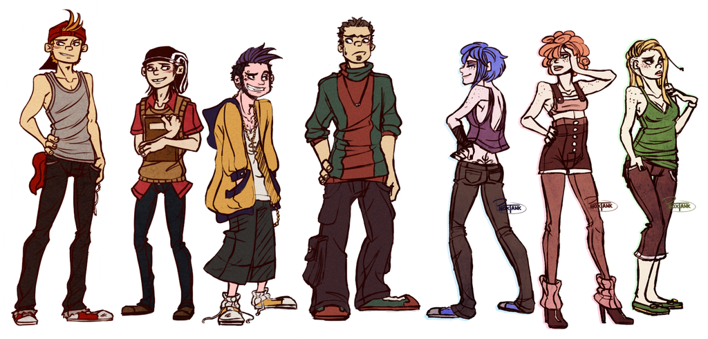
One of the Cartoon Network’s greatest hits, Ed, Edd ‘n Eddy follows the misadventures of three boys living in a cul-de-sac. To be utterly frank, the art style, while certainly unique, is also abjectly disgusting. Despite this, it was a perfect fit for the show’s content.
Artist Tanksi decided to take some time to re-do the show’s original look and has come up with a far cleaner take on some of the show’s characters. While things are certainly far more refined and digestible, they’ve astonishingly managed to maintain the most defining features of the original art, which is mightily impressive.
13 Dragon Ball Z
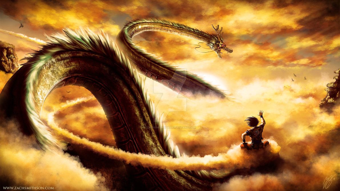
One of the most classic anime series in existence, the entire Dragon Ball franchise is absolutely iconic. Though the original series, Dragon Ball, would eventually get some time to shine in the spotlight, it was Dragon Ball Z that helped usher in the era of anime to the West.
Populated with the wonderfully iconic designs of Akira Toriyama, it’s hard to imagine any Dragon Ball product without that signature style, yet artist ZachSmithson does exactly that, rendering a hyper-realistic Shenron and Goku in a gorgeous piece.
It almost makes us think a live-action DBZ could work - almost.
12 Pokémon
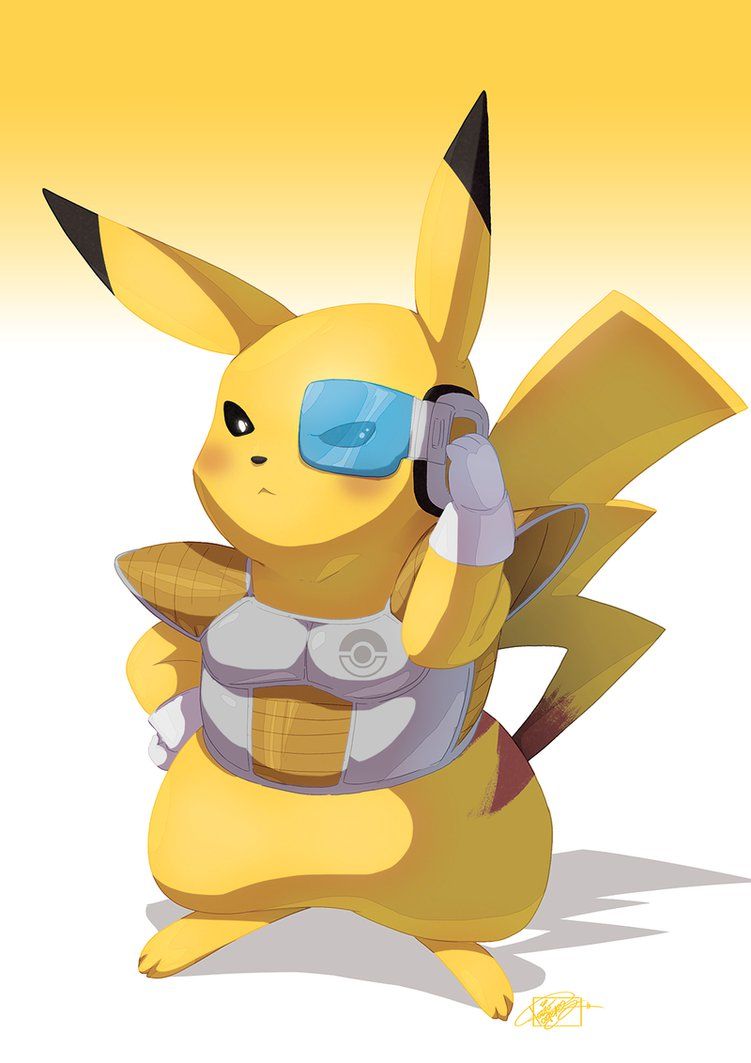
While Dragon Ball Z was one arm of the anime takeover of the West, Pokémon and Sailor Moon were the others. Pokémon was a massive hit, and, at its height, Pokémania was nearly comparable to Beatlemania.
While the show has continued to refine its look over its nearly 1000 episodes, artist TovioRogers thought it might be fun to take the original designs and cross them over with that of Dragon Ball Z. The finished product is bizarre, but… also kind of cool. In fact, it sort of makes us want to see this crossover become a reality.
11 Hey Arnold!
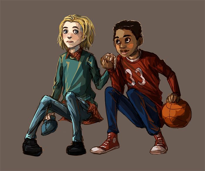
Hey Arnold!, much like Doug, was a Nicktoon that featured a main cast of kids just trying to live their lives. Unlike Doug, though, the cast of Hey Arnold! often found themselves in far more intense and outrageous situations. The show was also known for its odd blend of cartoony character designs (like Arnold’s football shaped head) with otherwise realistic elements.
Artist VivienKa decided to give Arnold and his best friend, Gerald, a makeover, and we love what we’re seeing.
Tossing aside the more cartoonish aspects, but maintaining certain iconic characteristics (like each character’s distinct hair) we end up with a unique piece.
10 Dexter's Laboratory
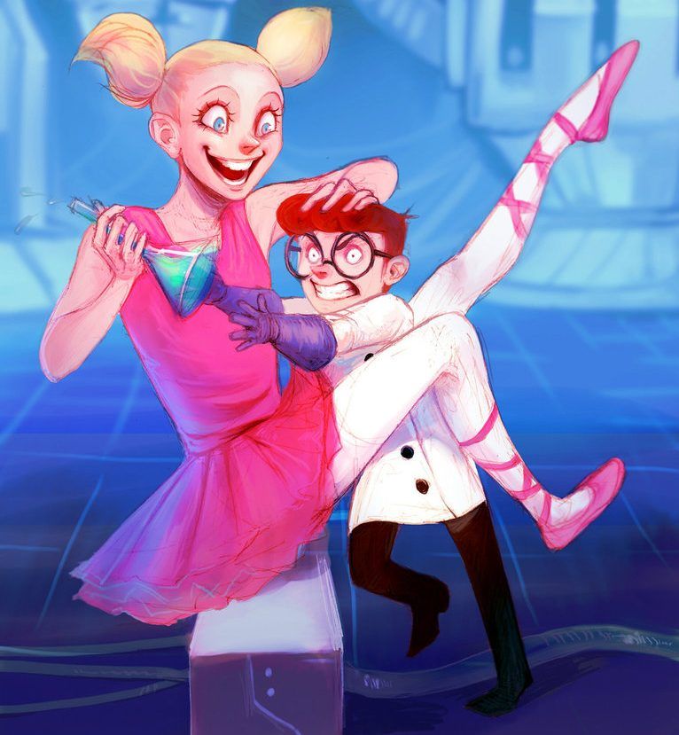
Genndy Tartakovsky’s distinct and iconic character designs were a common sight during Cartoon Network’s heyday, with shows like Foster’s Home for Imaginary Friends and Samurai Jack. Of course, the granddaddy of them all was Dexter’s Laboratory.
A brilliant (no pun intended) series focusing on a boy genius and his frustratingly dopey sister, the show’s humor, writing and overall look netted it countless fans. Despite its iconic aesthetic, artist Emilyena has done a fine job redesigning the siblings, breaking clean from Tartakovsky’s unique style but still capturing the traits that defined them both.
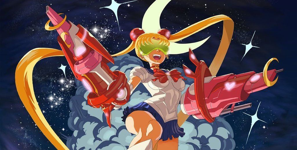
9 Sailor Moon
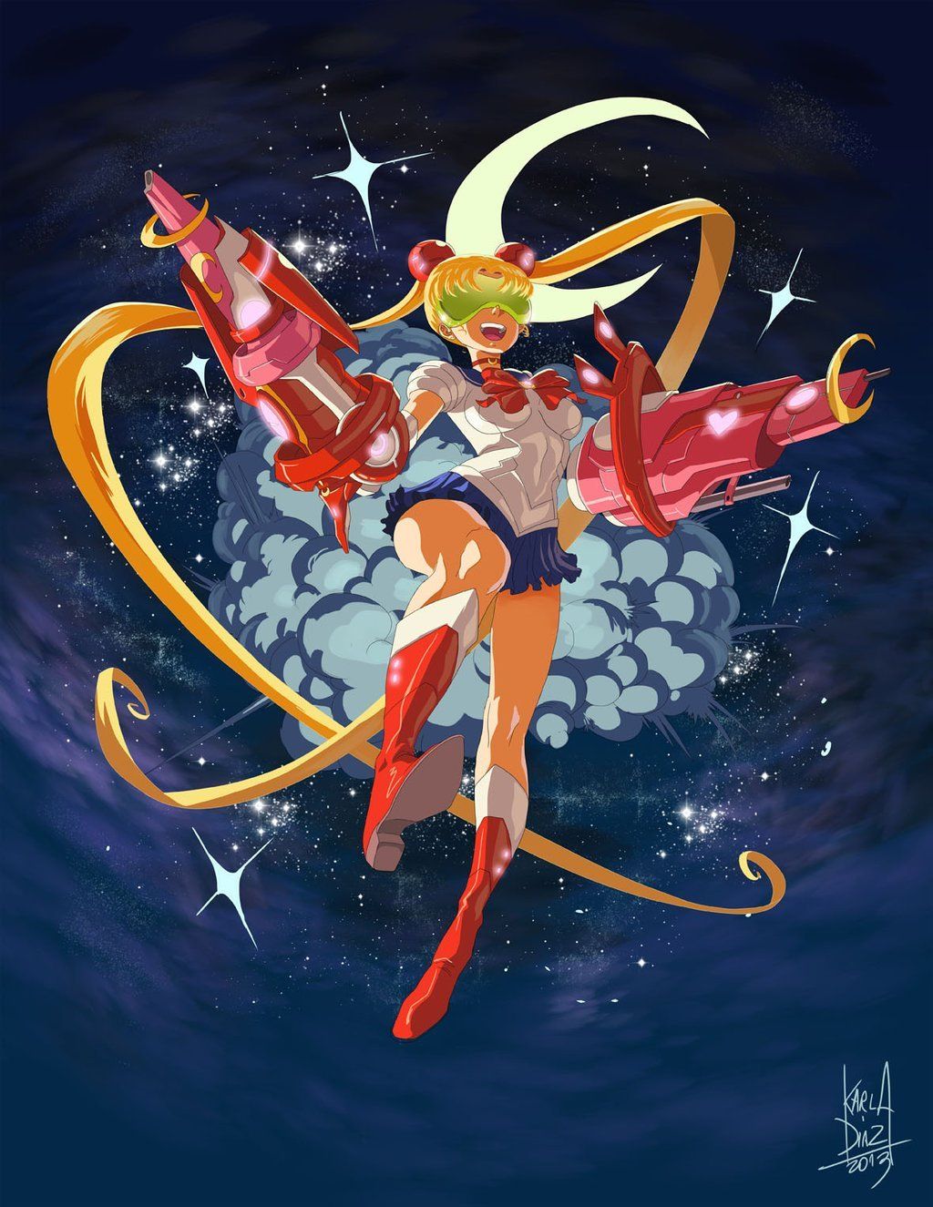
Dragon Ball Z, Pokemon and Sailor Moon were the major forces of anime that helped popularize the genre in the West during the '90s, so it’s only fitting that legions upon legions of fans have incredibly fond memories of watching these series in the early days.
Sailor Moon, like its compatriots, is monstrously popular to this day, and has inspired mountains of fan art, most of which dramatically redesign the iconic Sailor Scout designs.
The artist, KarlaDiazC, has given Sailor Moon an absolutely awesome sci-fi look, complete with visor and massive arm cannons… and we can’t help but think this is the coolest thing we’ve ever seen.
8 The Wild Thornberrys
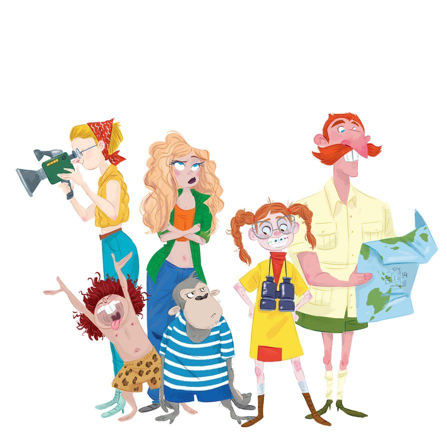
The Thornberrys themselves may have been late in the game in terms of the “the 90s,” but they were still part of that generation’s Nickelodeon-fueled entertainment. Following a family of wild life documentarians, the youngest daughter, Eliza, was granted the power to speak to animals.
Produced once again by Klasky Csupo, the Wild Thornberrys had that studio’s signature look, but one that was far more refined and sleek. Still, we love what Lelpel did with the cast in this piece. Going from one distinct artstyle to another with seemingly nothing lost in translation is a difficult feat on its own, but the fact that we hardly miss the old designs is even more impressive.
7 Johnny Bravo
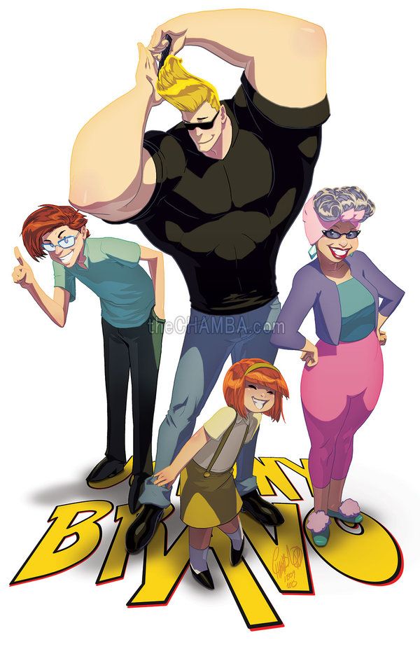
Johnny Bravo was one of Cartoon Networks most popular shows, and with good reason: its outlandish concept, easily-lovable oaf of a main character, and its continually sharp writing made it a treat to enjoy. It also has one heck of a distinct look, with bold and easily identifiable character designs and aesthetics.
Artist theCHAMBA decided to give the iconic a show an updated, anime-inspired look and, honestly, it’s pretty darn great.
While we’d love to see a Johnny Bravo reboot, we’re definitely more interested in an absolutely outlandish anime adaptation, because this picture is selling it to us pretty well.
6 Freakazoid!
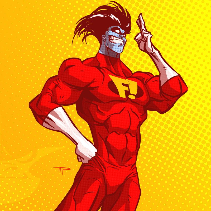
While Animaniacs lampooned cartoons, celebrities and culture, it was up to Freakazoid! to properly roast superheroes. Created by Bruce Timm and Paul Dini of Batman: The Animated Series fame, the titular Freakazoid is a completely bonkers protagonist in a world of equally insane super-villains.
Artist 800PoundProductions took the simple Freakazoid design, added a slight bit of comic-styled detail, and bulked him up, creating a far more imposing figure than the simply designed superhero we’re used to. Despite his far more chiseled appearance, the unhinged look that’s perfectly captured on his blue face assures us that this is the same lunatic that we know and love.
5 Beast Wars
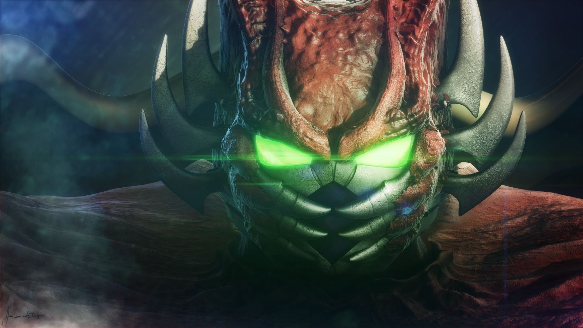
While ReBoot was the first fully-CG animated television show, and wildly popular in its own right, Beast Wars, created by the same company, managed to revolutionize an entire brand while also carving out one of the absolute best kid’s shows in existence.Transformers was no longer about selling toys… well, it actually still was, but, this time, characters and story-telling came first.
Like ReBoot, Beast Wars’ CGI has aged considerably, and the Transformers community has long wondered what Beast Wars might look like if it ever received some kind of “HD Remaster,” and artist MisterJL has delivered.
This high-def render of Rampage is exquisite, and we’re prepared to beg Hasbro to make this a reality.
4 Aaaah!! Real Monsters
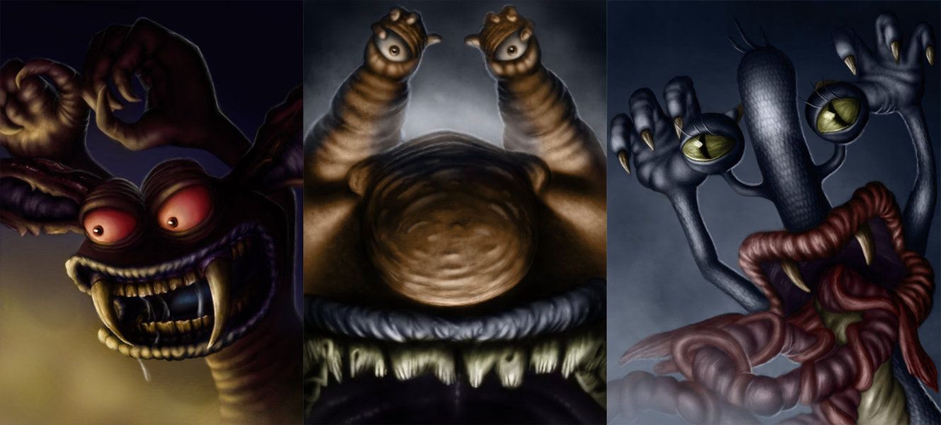
Aaahh!! Real Monsters was another one of Klasky Csupo’s famous Nicktoons, complete with their oddly deformed style. Centering around monsters in training, the show is filled to the brim with grossout content, disgusting character designs and an underlying tone of dread… all of which combined made it something great.
Artist LanceRousseauArt made an attempt to update the original look of the trio of main characters, and has focused on giving them a much needed edge. The results speak for themselves, with grossness and terror mixed into one perfect piece. We’d kind of scared to see the Gromble in this style, though.
3 Darkwing Duck
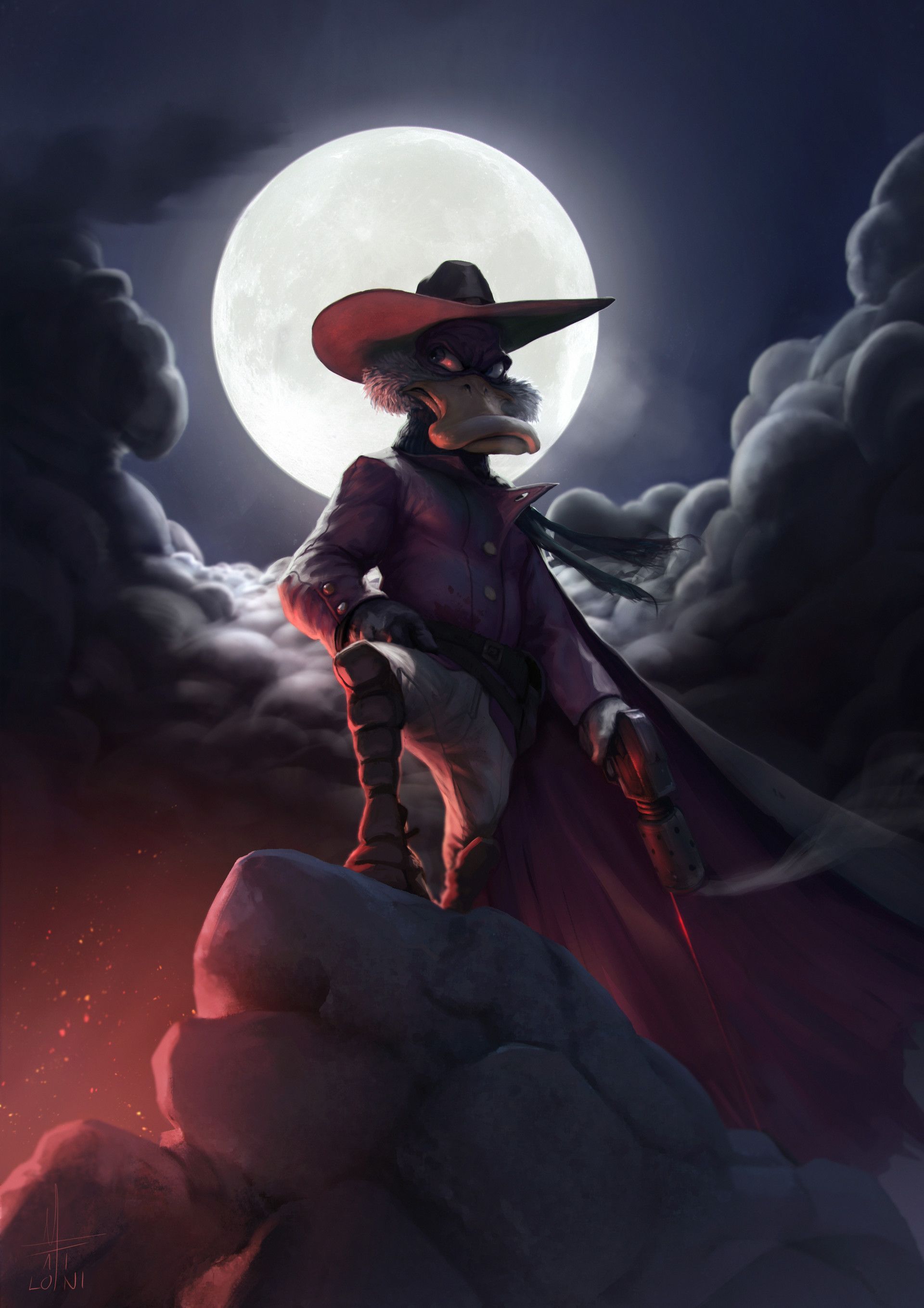
Drake Mallard seems like a normal duck, but he harbors an incredible secret: beneath his mild-mannered exterior, he is the fame-obsessed superhero, Darkwing Duck. Dripping with Disney’s '90s aesthetic, Darkwing Duck captivated fans young and old, and ended up creating an action-packed series with memorable characters.
Almost completely abandoning the original, 90s look, the artist, Mirko, has given us the Duck we need, not the one we deserve.
Aside from his anthropomorphized features, this Darkwing Duck takes a hyper-realistic approach, with brilliant use of color to create an appropriate atmosphere of menace for a brooding hero such as this.
2 Mighty Max
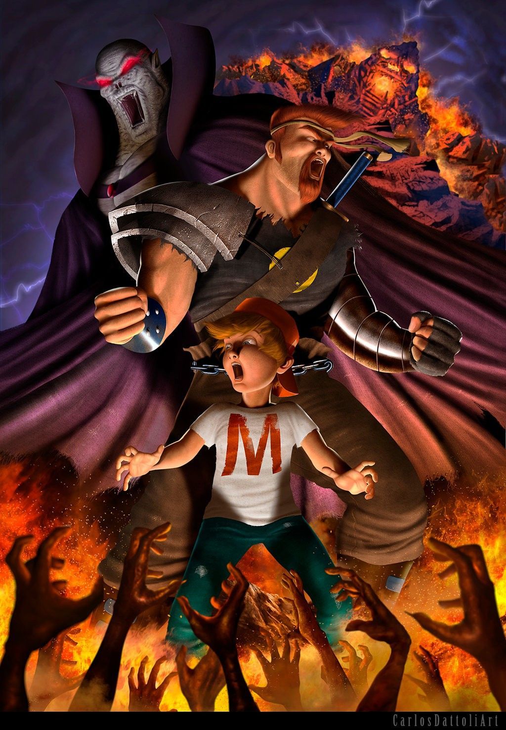
Based on a series of toys that were a little like Polly Pocket on LSD, Mighty Max was about a young boy and his protectors as a magic hat allowed them to travel to multiple realms, all while trying to defeat the dreaded Skullmaster. While the show’s original look is a treasured blend of 90s cheese, artist CarlosDattoliArt takes things to the next level with their incredible design update.
Skullmaster looks absolutely hellish, Norman looks appropriately barbarous, and Max himself looks terrified… and rightfully so. If Beyblade is still a thing, why isn’t Mighty Max?
1 Gargoyles
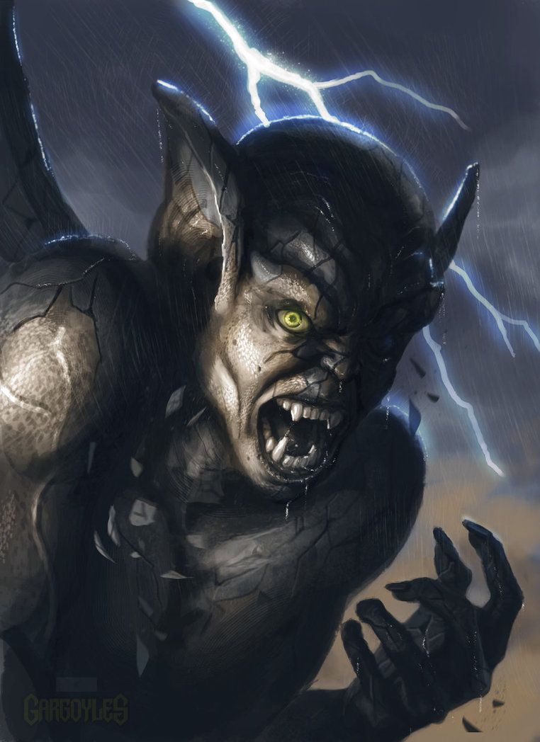
While Batman: The Animated Series was making an incredible name for itself both artistically and commercially, Disney responded with their own take on the dark hero genre with angular designs: Gargoyles. A fantastic show that touched legions of fans with its wonderful characterizations, incredible lore (including incorporating Shakespeare!) and impactful emotional moments, Gargoyles is long overdue for the live-action remake treatment.
Thankfully, ImmarArt heard the call. Their incredible take on Lexington awakening after a long day is absolutely stunning.
The look in his eye, the cracking stone, the refined designs and crack of lightning make this a masterpiece. Fingers crossed for a movie in this style.
---
What do you think of these fan redesigns? Which one would you like to see on screen? Let us know in the comments!
from ScreenRant - Feed https://ift.tt/2DH2VuK


No comments: