DC has played a major role in making the superhero genre what it is today. Through the comics, DC brought beloved characters like Wonder Woman, Batman, Superman, and countless others to life. These characters and their stories became so popular that they were eventually adapted into an array of movies and television shows.
After seeing the success of the Marvel Cinematic Universe, DC decided to compete with their own shared live-action movie universe. Referred to by most fans as the DCEU, the universe launched with the 2013 release of Man of Steel.
Despite high hopes from many, the DCEU hasn't met most expectations. Only Wonder Woman managed to be incredibly well-liked while the other four movies received mostly mixed to negative reception. All the films include entertaining moments, but they also all contain moments and designs that could've been better.
Visually stunning concept art reveals how all of these movies could've been different and, in certain instances, how they could've been even better. Some concept art is not a significant departure from what fans ending up getting, while some examples would have completely changed the movie. The latter is particularly true for Suicide Squad, as the concept art offers insight into how it could've been a drastically different movie, especially where the Joker and the story's end are concerned. Some are just a matter of how a certain scene or character aesthetic could've been improved, while others indicate significant changes made in a film's plot.
Here are the 20 Unused DC Concept Art Designs Better Than What We Got.
20 Steppenwolf (Justice League)
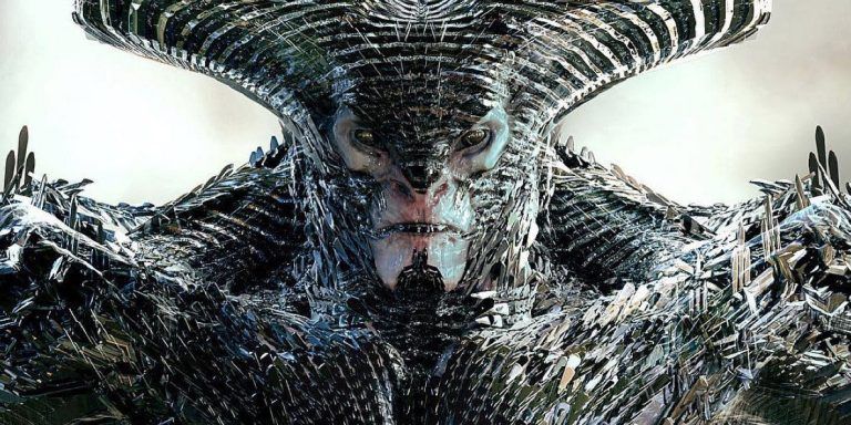
Justice League was a disappointment for many audiences, but arguably the movie's biggest letdown was Steppenwolf. Played by the talented Ciarán Hinds, fans expected the most formidable and well-developed villain yet in the DCEU. Unfortunately, the writing for the character didn't meet these expectations, nor did the heavy CGI of his design.
If Steppenwolf's design would've been closer to this concept art, he would've been far more intimidating to behold.
His entrance on Themyscira would've seemed more frightening with this kind of design. The aesthetic wouldn't make up for how the character was written, but at least it would've given him a more distinctive and fearsome look, solidifying him as a more memorable and worthy foe of the Justice League.
19 Joker In The Final Fight Against Enchantress (Suicide Squad)
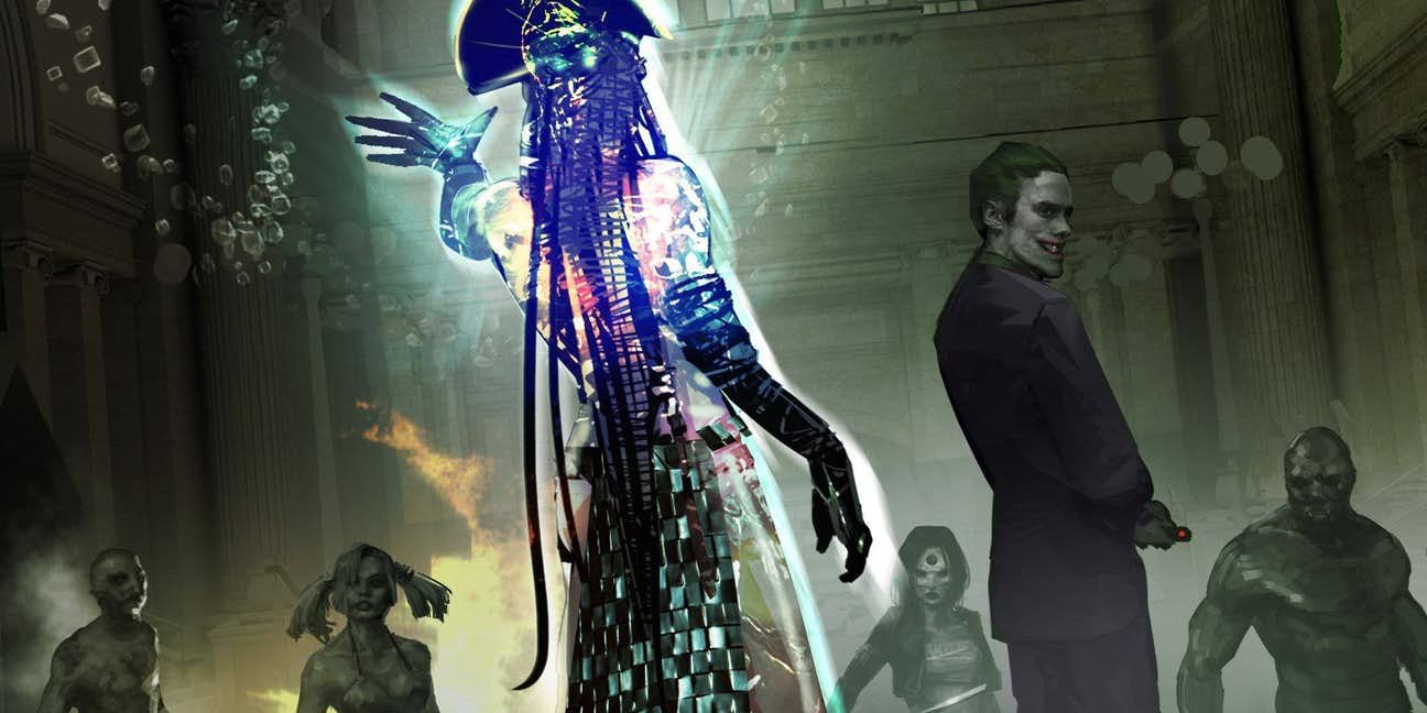
While fans have differing opinions on Jared Leto's Joker, most agree that it was the wrong call to cut so many of his scenes from Suicide Squad. There are many ways his role in the movie could've been very different, one of which is shown in this concept art. Instead of just showing up at the very end to break Harley Quinn out of prison, the Joker could've resurfaced earlier to join his beloved and the rest of the Suicide Squad in their final battle against Enchantress.
In the final version of the movie, the Joker doesn't serve much of a purpose. This could've been partly rectified by showing up in this way, a more cunning and unpredictable adversary for Enchantress.
18 Yalan Gur Green Lantern (Justice League)
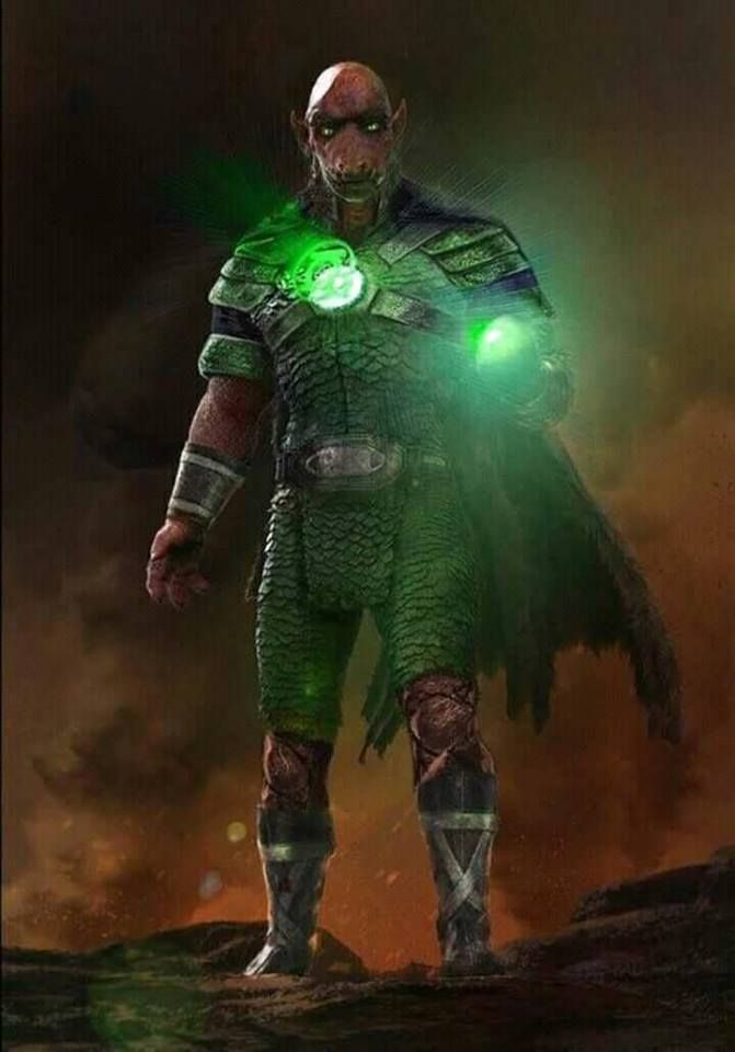
Many fans were hopeful that Justice League would bring in the Green Lantern Corps. Hopes were mostly dashed as Justice League only featured the Green Lantern Corps in a blink-and-you'll-miss-it cameo. A few can be briefly seen in the flashback that showed them uniting with Amazons, Atlanteans, and humans the last time Steppenwolf and the forces of Apokolips invaded Earth.
Concept art indicates that at one point there were ideas to include Green Lanterns in a much bigger way, namely through the character Yalan Gur.
Some fans have made the case that Yalan Gur actually does appear in the move as one of the Green Lanterns in the flashback. For the sake of the DCEU's world-building, it would've gone a long way to show more of the Green Lanterns and Yalan Gur, even just in flashbacks.
17 Kryptonian War Dog (Man Of Steel)
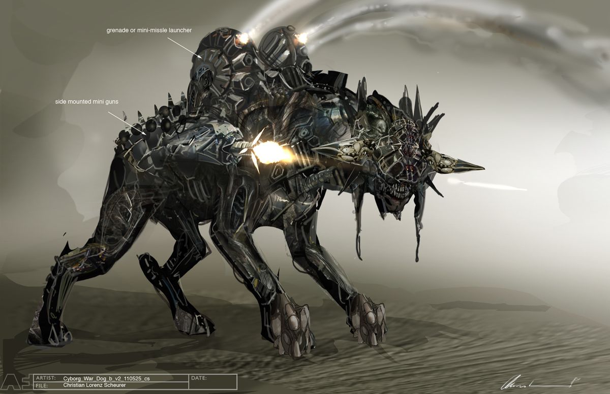
Man of Steel was at its best in the beginning scenes on Krypton. An incredible amount of world-building was shown in a short amount of time with the planet's technology, politics, and even creatures like the H'Raka that Jor-El flies. Concept art reveals how there could've been even more fascinating pieces added to those early scenes with this image of a Kryptonian War Dog.
Completely different from Krypto the Superdog, this being is a cyborg fitted with a grenade or mini-missile launcher and mini guns mounted on the side. The Kryptonian War Dog look ferocious and has the firepower to prove it. General Zod using these creatures in the beginning would've made him an even more scary and ruthless villain. Just imagine them being used to pursue Jor-El.
16 Ares (Wonder Woman)
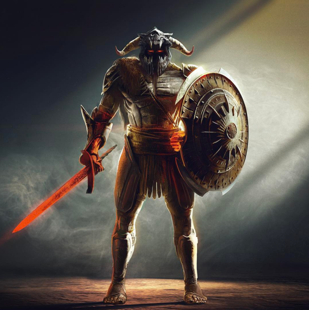
Wonder Woman is by far the most popular and well-received of the DCEU movies. Even critical darlings receive criticism, though, and for Wonder Woman it's how the villain Ares was handled, including the final battle between him and Diana. Part of this criticism is rooted in design as Ares in battle ended up looking like little more than a standard CGI villain.
The design in this concept art could've worked better as it has a more practical, grounded look inspired by Greek mythology.
Such an appearance also would've felt more consistent with the costumes and aesthetic of Wonder Woman and her fellow Amazons. The heavy CGI felt jarring because it was so inconsistent with what audiences had been seeing in the movie up to that point, but with this design that wouldn't have been a problem.
15 Joker And Harley At A Drive-Thru (Suicide Squad)
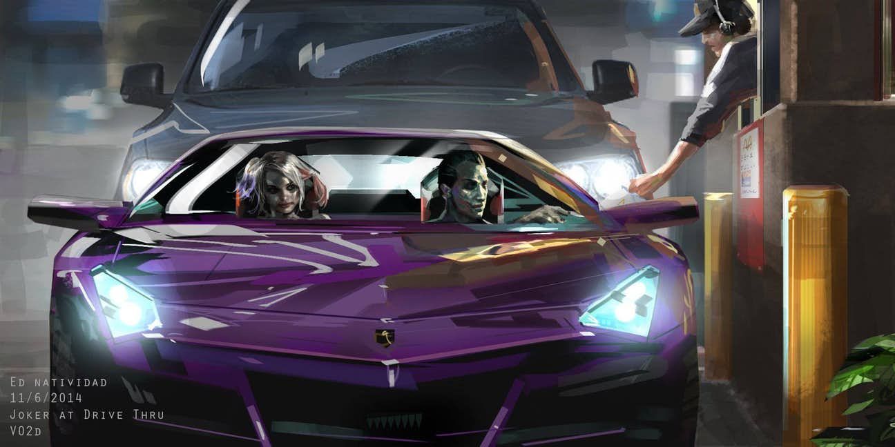
Despite featuring both the Joker and Harley Quinn, Suicide Squad didn't offer much of the crazy, entertaining antics that usually comes from their relationship. Concept art of them going through a fast food drive-thru offers a glimpse at the kind of Joker-Harley fun audiences were denied.
This certainly wouldn't have been a major scene, but there's something undeniably thrilling about such psychotic characters doing something so mundane. It would've been a highly amusing scene and could've gone any number of ways given the unpredictable nature of both the Joker and Harley. It's exactly the kind of bizarre, little moment that would've made Suicide Squad a much more entertaining movie. It also would've helped do a better job of exploring and setting the foundation for the unique Joker-Harley relationship.
14 Taking Doomsday To The Skies (Batman v Superman: Dawn Of Justice)
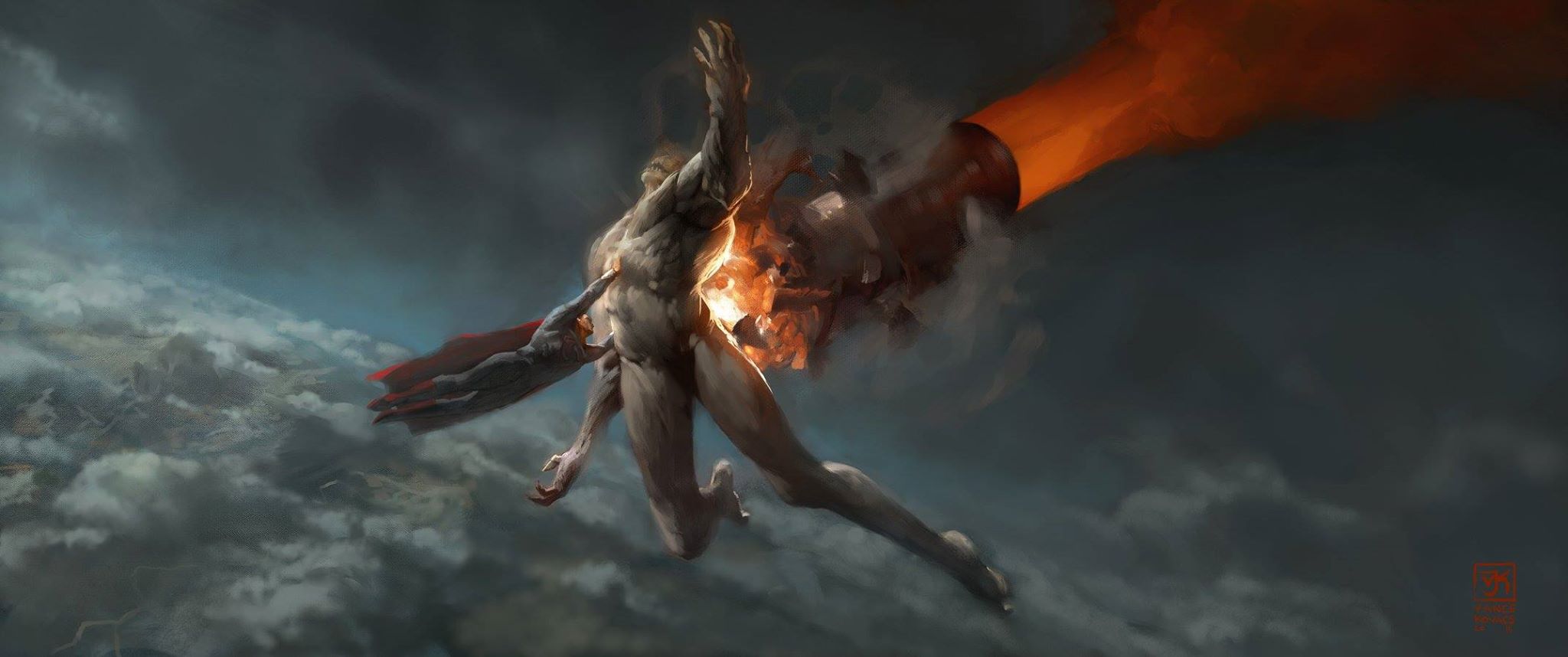
Doomsday was always going to be defeated, but this concept art shows how his end could've been quite different. Doomsday appeared to have the ability to jump thousands of feet and temporarily defy gravity when he briefly followed Batman and the Batwing across the skies back to Gotham.
Superman can fly as much as he likes, though, and this image shows him using that ability to defeat Doomsday, taking the monster to the skies.
With Superman's limitless flying ability and Doomsday's ability limited, this air-bound fight seems like an important edge that the Man of Steel didn't take advantage of in the movie. Doomsday can only be destroyed via Kryptonite, though, meaning he would only be defeated here if the missile was made of Kryptonite. Seeing as Kryptonite missiles have been used in DC stories before, it wouldn't have been unprecedented to use one here.
13 Gotham City (Batman v Superman: Dawn Of Justice)
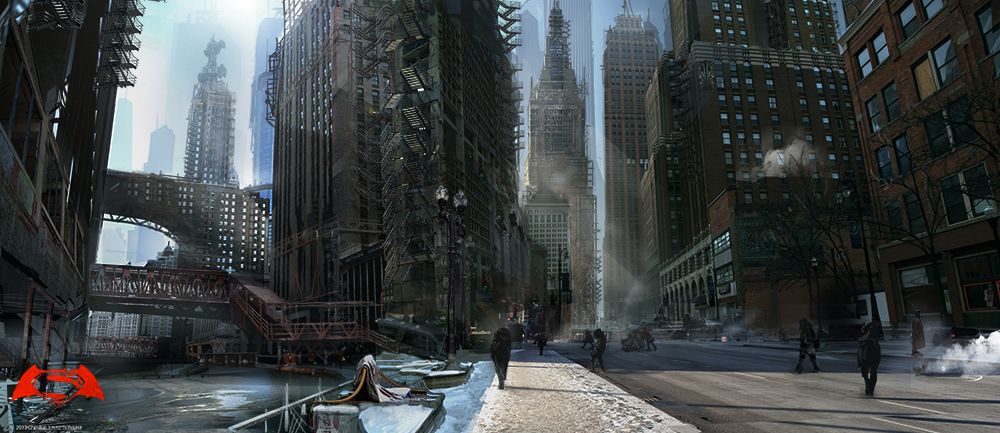
Gotham City certainly appears in Batman v Superman, but it doesn't look anywhere near as remarkable as it does in this stunning concept art. In the movie, Gotham looks generic and not much different from other onscreen cities. This depiction of Gotham shows a city with its own unique identity and aesthetic. It looks lived-in, a place where crazy stuff can happen, but people continue to go about their everyday nonetheless. This is a Gotham worth fighting for, the kind of place that Batman has protected for years and feels obligated to continue defending, especially in light of the dangerous threat he perceives in Superman.
It actually could've been quite powerful to open the film with this beautiful image and then see it destroyed during Superman's fight with General Zod, the very catalyst for the anger and fear Batman feels towards the Man of Steel.
12 Scarecrow (Suicide Squad)
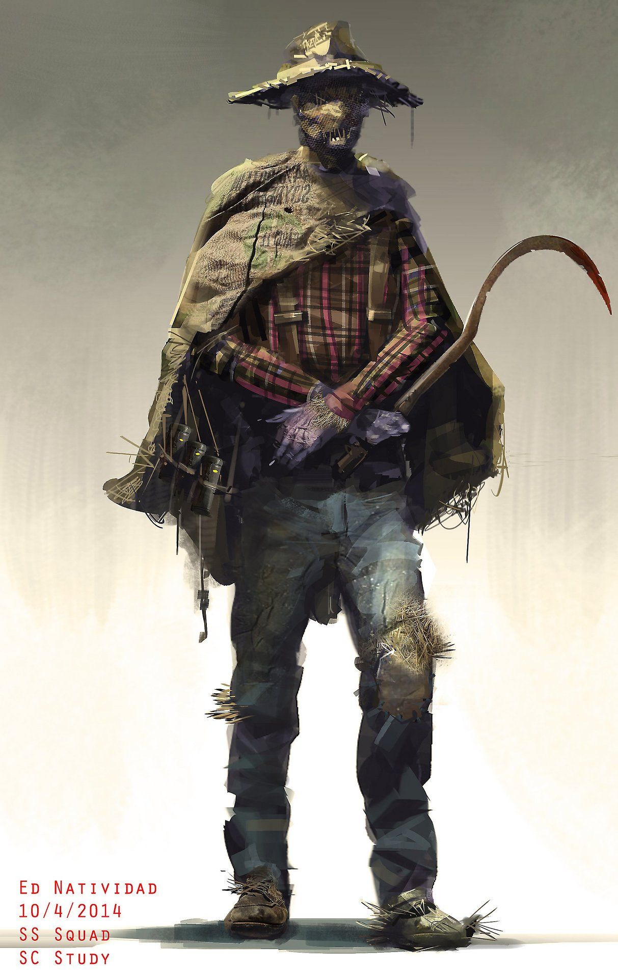
Suicide Squad has been criticized for not only introducing too many new characters, but also for not giving fans reasons to become invested in the new characters. Part of the issue is that the movie simply didn't have time to provide ample, satisfying backstory for each member of the Suicide Squad, and what they attempted to do felt sloppy and rushed.
This could've been made better by using the Batman villain Scarecrow, as pictured in this concept art.
Through the character's inclusion throughout Christopher Nolan's Dark Knight trilogy, mainstream audiences already possessed a fair amount of knowledge about Scarecrow. What they don't know is made up for by the character's eerie design in this picture, an aesthetic that not only looks great but communicates a great deal. It might've been too much to add Scarecrow onto all the existing members of the Suicide Squad, but he could've been a better choice than some of the characters audiences ended up getting.
11 Themyscira (Wonder Woman)

Themyscira was a beautiful and majestic sight to behold in Wonder Woman. One shot that could've made it even better is captured in this piece of concept art. The sunrise is stunning in itself, but it's also a remarkable image in how it highlights the unique terrain and elevations of the island. This more than anything visually communicates that Themyscira is a paradise existing out of time, making it all the more difficult for Diana to leave with Steve Trevor.
It might've been even more bittersweet for her to leave as the sun rose like this over Themyscira as opposed to leaving at night. There's still a chance to showcase Themyscira like this in future movies featuring Wonder Woman and the Amazons.
10 Destroying Doomsday Together (Batman v Superman: Dawn Of Justice)
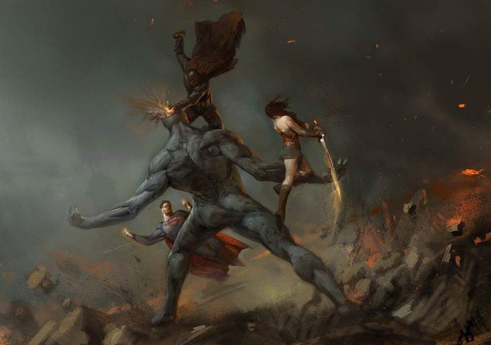
Superman, Batman, and Wonder Woman do fight together to defeat Doomsday. This concept art is an entirely different ending to their unified fight than the one seen in the final version of the film, though. Instead of Superman sacrificing himself in order to destroy Doomsday, all three heroes get much closer to their monstrous foe. Most importantly, it is Batman and not Superman who delivers the fatal blow.
This would've changed the trajectory of the DCEU and Justice League in particular.
It arguably would've made more sense, though, since the plan was to bring back Superman anyway. The ending would've been more about what they were able to achieve as a team working together and less about Superman being the ultimate hero.
9 Krypton Lower City (Man Of Steel)
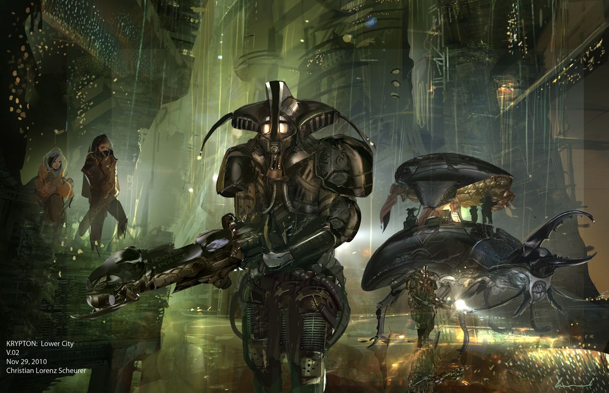
The beginning of Man of Steel provided incredible insight into the world of Krypton, showing audiences the astonishing heritage and birthplace of Superman. The visual designs were breathtaking and enhanced the world-building in a mere handful of scenes. Concept art such as this shows how it could've been even better, offering a look at Krypton's lower city. There's a glimpse of the more common folk who inhabit Krypton, which is refreshing since audiences really on get to see the ruling Council of Krypton, the extremist General Zod, and Superman's parents who are certainly among the planet's more prominent and privileged citizens.
The word "police" can be made on the lead figure's gun in the picture, meaning this is a look at the kind of law enforcement Krypton has in the lower city. This is a rare case where law enforcement actually looks cooler than the villain as this armor is far more impressive than that of General Zod and his cronies.
8 Joker In The Batmobile (Suicide Squad)
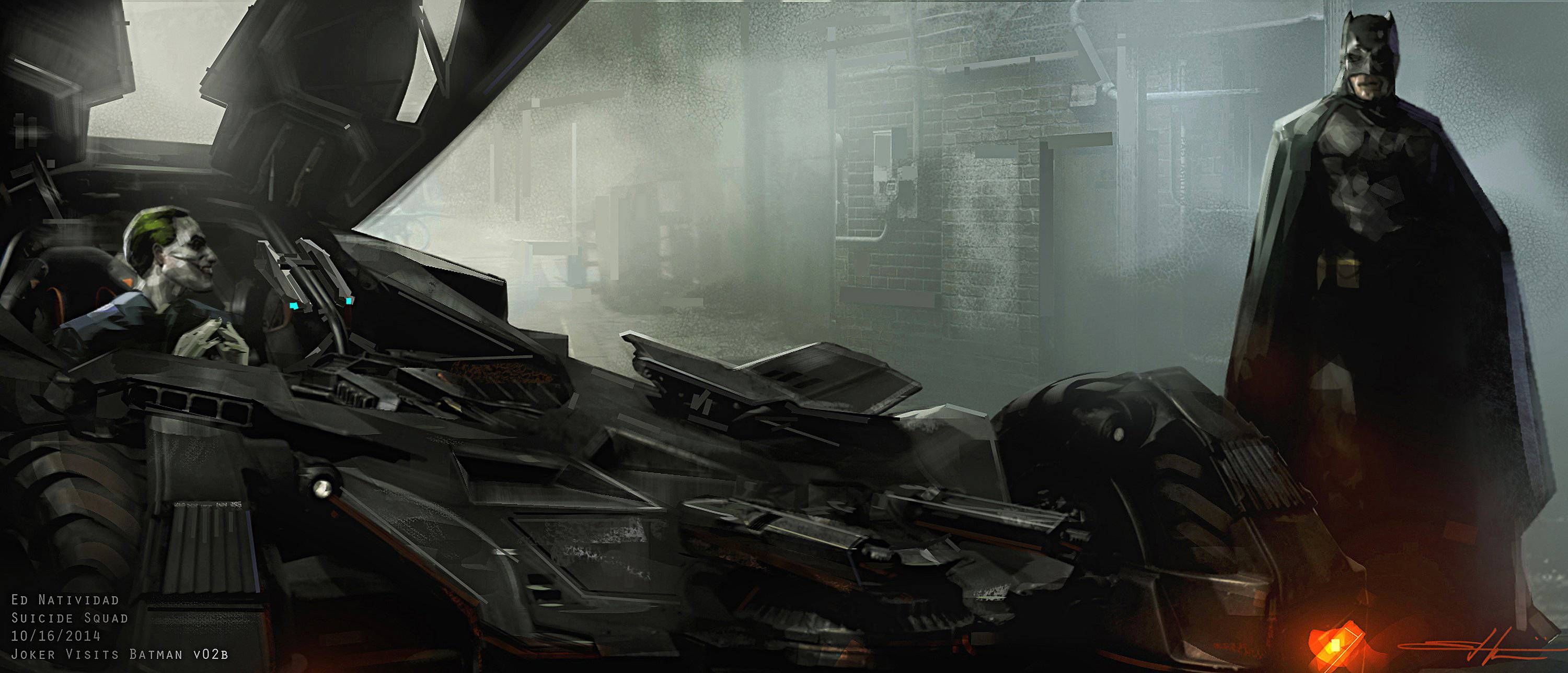
Batman and Joker have one of the greatest rivalries not only in the superhero genre, but in all entertainment. Despite having both characters in the same movie, Suicide Squad did almost nothing with their relationship.
Concept art shows how the movie could've taken advantage of Joker and Batman crossing paths for the first time in the DCEU.
The Joker loves to taunt and antagonize Batman, and what better way to do than by getting inside the Caped Crusader's prized Batmobile? Seeing Jared Leto's Joker and Ben Affleck's Batman interact more would've created a better foundation for their characters' relationship in the DCEU. Their story wouldn't have been the focus of Suicide Squad, but it certainly could've been worked in better and made fans eager to see more of these versions of Joker and Batman in future DCEU films.
7 Superman's Funeral (Batman v Superman: Dawn Of Justice)
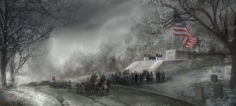
Following his heroic sacrifice to destroy Doomsday and save humanity, there's a public funeral for Superman and a more private one for Clark Kent. The contrast works well, but this piece of concept art shows how Superman's funeral in particular could've been more powerful.
This image evokes a sense of tragic, yet beautiful serenity. The gray skies, barren trees, the shadows they cast, and a light dusting of snow adds to this sense, and the coldness felt by all in a world that can no longer be protected by Superman, a world that only remains safe because of his sacrifice. It feels like more fitting of a sendoff to Superman than the funeral fans got in the movie.
6 Enchantress Creates A Boom Tube (Suicide Squad)
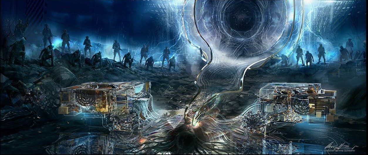
Boom Tubes are the portals that Darkseid and his generals use to travel around the universe. Steppenwolf uses one when he arrives on Themyscira with his Parademon army in Justice League. Enchantress creating a Boom Tube indicates her creating a portal for Darkseid, Steppenwolf, and their armies to travel through in order to reach Earth.
It would've made for a great twist for audiences thinking that Enchantress was the movie's main villain and endgame, only to reveal it had all been about using her to bring in the bigger DCEU threats of Darkseid or Steppenwolf.
Not only would it have made for a great twist, but it would've made Suicide Squad matter more and have further connection to the rest of the DCEU, especially with the trajectory established in Batman v Superman and the plan for Justice League.
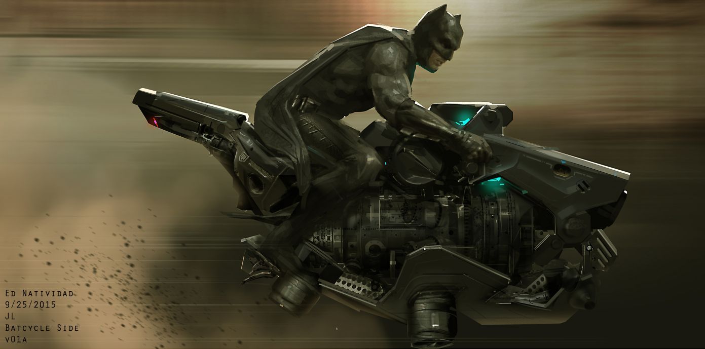
5 Batcycle (Justice League)

The Batmobile played an important role in Justice League, particularly in the final battle against Steppenwolf and his army of Parademons. Batman almost had a very different ride with the Batcycle featured in this concept art.
Different than more the more traditional Batcycles like the one in Christopher Nolan's Dark Knight trilogy, this one looks closer to a hovercraft. Of course it would've been far more than just a hovercraft, surely weaponized with versatile and advanced technology. The Batmobile served Batman well in the movie's final battle, but this picture can't help but make one think how cool it would've been to have him zooming around on this Batcycle while fighting Steppenwolf and his forces.
4 Parademon Seals (Suicide Squad)
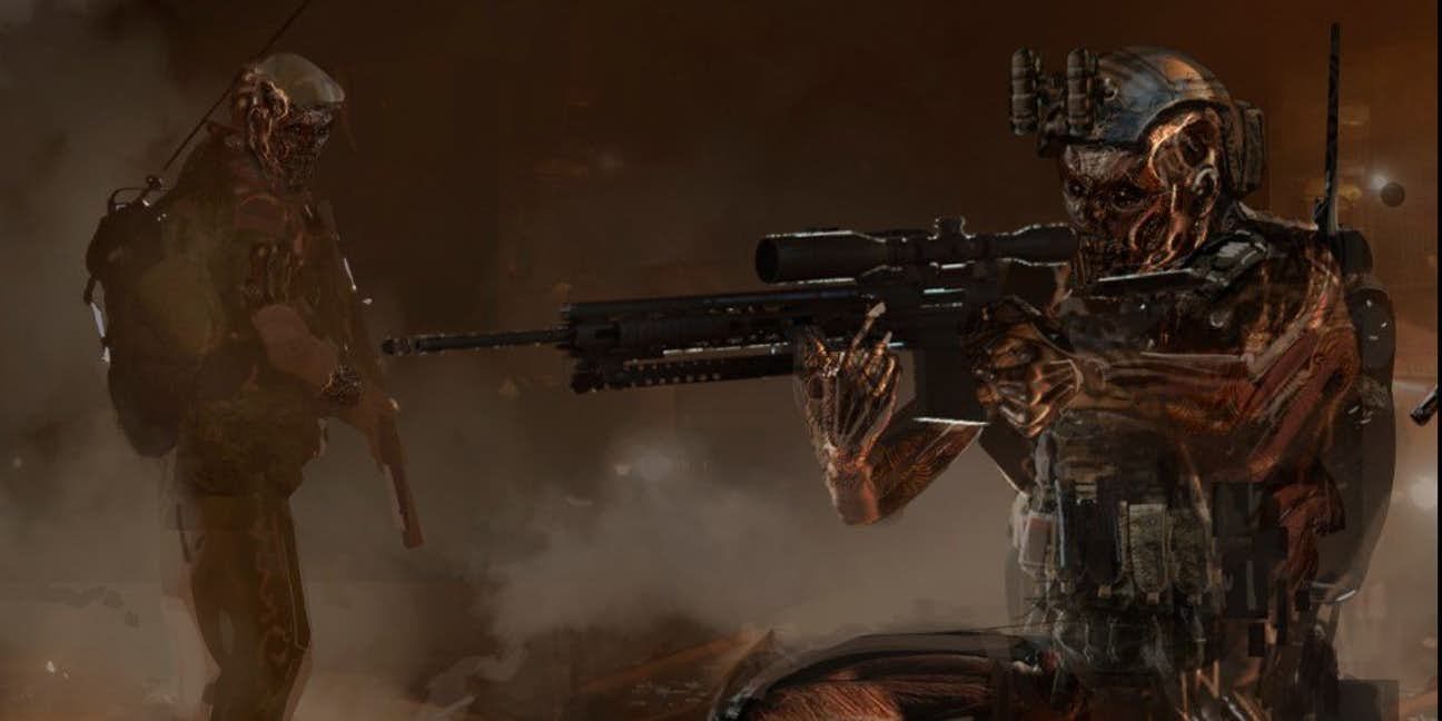
This concept art hints at how Enchantress could've not only bolstered her forces, but also have her schemes tie to Justice League in a big way. The image features Rick Flagg's soldiers turned into Parademons.
Parademons are the same soldiers from Apokolips that Steppenwolf would use in Justice League.
This in addition to concept art of Enchantress creating a Boom Tube indicates that she and Steppenwolf would've worked together or at least made a deal, part of which would've involved being able to turn Flagg's soldiers into Parademons and using them for her army. The idea of trained human soldiers mixed with Parademons is a frightening one that would've established the Parademons as a more legitimate threat for Justice League.
3 Wonder Woman's Final Battle Against Ares (Wonder Woman)
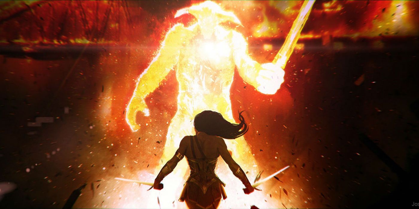
For those who didn't like the CGI used to create Ares in the final battle against Wonder Woman, they're probably going to like this concept art of Ares as a living embodiment of fire even less.
At the same time, this version of Ares looks far more intimidating and powerful and definitely more like a god. He certainly couldn't remain in the guise of human politician Sir Patrick Morgan. A transformation into this fiery being would've been more impressive than the transformation fans got. Wonder Woman even looks better here as she wields not one but two swords against Ares. It's certainly subjective, but some audiences would've been happier with the final battle looking closer to this vision.
2 Justice League Fighting Together (Justice League)
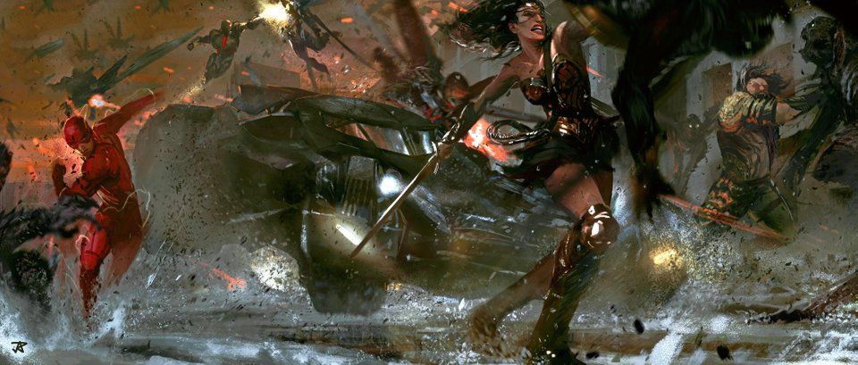
Batman, Wonder Woman, Flash, Aquaman, Cyborg, and Superman do all come together to fight Steppenwolf and his army of Parademons at the end of Justice League. That being said, there is no shot in the movie that captures them working together as beautifully as this one.
It's an epic image that captures each character in their element, using their individual strengths as a team to save the day.
If the movie had managed to capture a shot like this, it could've been one of the DCEU's most memorable and defining moments. It could've been akin to the moment where Iron Man, Captain America, Black Widow, Thor, Hulk, and Hawkeye circle up in The Avengers, a moment fans automatically think of in association with the MCU and its iconic superheroes fighting together.
1 Steppenwolf's Surprise Entrance (Suicide Squad)
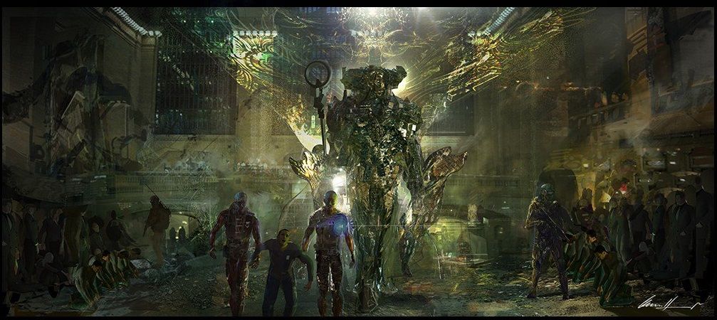
Concept art shows how in a stunning twist, Steppenwolf could've made a surprise entrance in Suicide Squad. Fans would've been shocked to see the events of the movie leading to this formidable villain. It would've made for amazing setup and a compelling cliffhanger to have Steppenwolf and his army on Earth before Justice League even began.
Others would argue that including Steppenwolf in Suicide Squad would've been jumping the gun, cramming him into a story where he didn't really belong. It might've taken away from what the movie was trying to do with its core characters, but it certainly seems like it could've helped Suicide Squad feel like a more meaningful piece of the DCEU.
---
What's your favorite unused DC concept art design? Let us know in the comments!
from ScreenRant - Feed https://ift.tt/2xYIdkr


No comments: