It takes a lot of vision, creativity, and imagination to bring a Disney project to life. Whether it's a full-length animated motion picture or a gigantic theme park beloved by millions around the world, all Disney ideas and concepts start out as sketches and storyboards ready for application.
But if you think Disney only works in paper and pencil for even their early concepts, you are what we in the business like to call wrong. Some of the most brilliant animators and artists work under the mouse, and even some of their early sketches and artwork are practically museum quality. Have a look at some of these beautiful pieces of unused Disney art.
10 Prince Philip And The Dragon
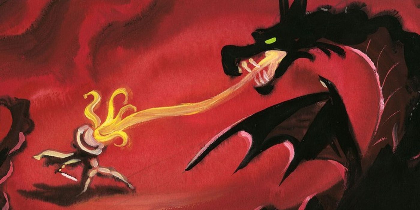
Sleeping Beauty, unlike some of the studio's prior films, took a different direction with its art style, wanting to take a more medieval approach to the background and visuals. Take a look at this early concept of Prince Philip and Maleficent and tell us it doesn't remind you of a fantasy novel cover or a dungeon master screen.
Though it's a little rougher than the final product, we'd love to see a framed print of this hanging in our game room or nerd cave next time we have a tabletop gaming session. If it's one thing Disney does right, it's creating worlds of fantasy.
9 Marc Davis's Maleficent
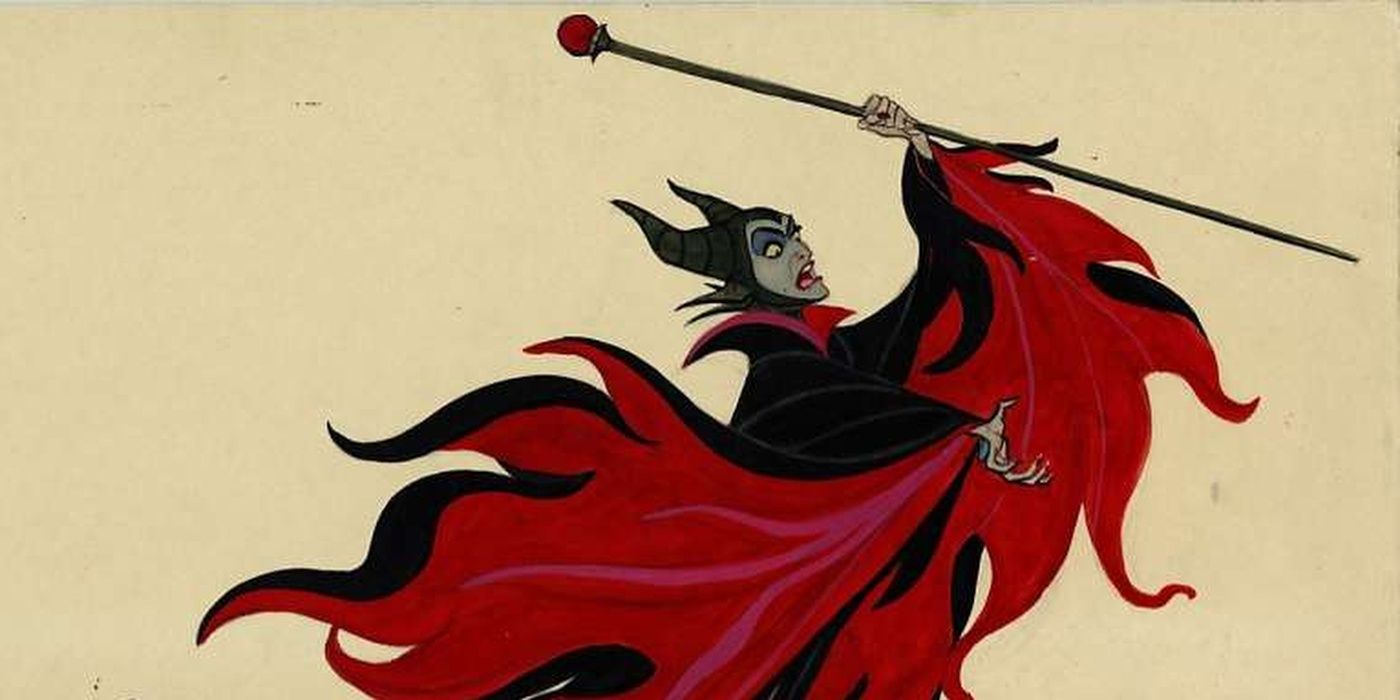
On the subject of Maleficent, if you know anything about Disney animation history, then you undoubtedly know the name Marc Davis. Marc Davis was one of Walt Disney's original animators and is responsible for creating characters like Cruella De Ville, Tinker Bell, and most famously, Maleficent.
In her developmental stages, Davis wanted a more demonic or draconic appearance for the Mistress of All Evil, so instead of the purple and green motif we see today, he wanted more red and black to simulate flames. The directors thought this clashed with the backdrops and environments, so it was changed. Still, it's a great piece of work.
8 A Very Merry Unbirthday
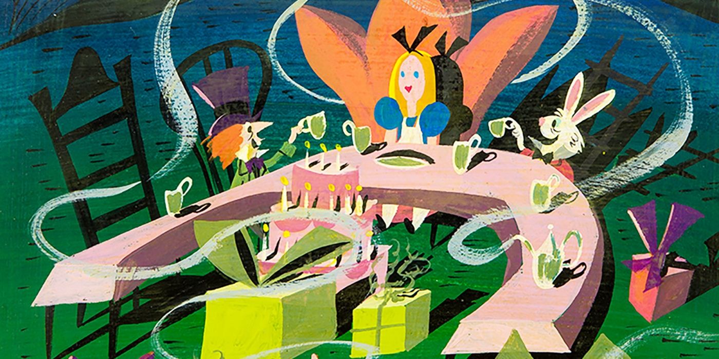
You might not know her name, but if you've ever set foot in a Disney Park, you've seen the artwork of Disney Imagineer Mary Blair. Blair was famous for her use of bright colors and shadows to create brilliant designs that simply leaped from the screen, like this storyboard from Disney's Alice in Wonderland.
Though she worked on many projects like Cinderella and Peter Pan, her most famous designs can be seen in Disneyland's It's a Small World. Truly an unsung hero of Disney animation, we could dedicate a list to her work alone.
7 Black Cauldron By Burton
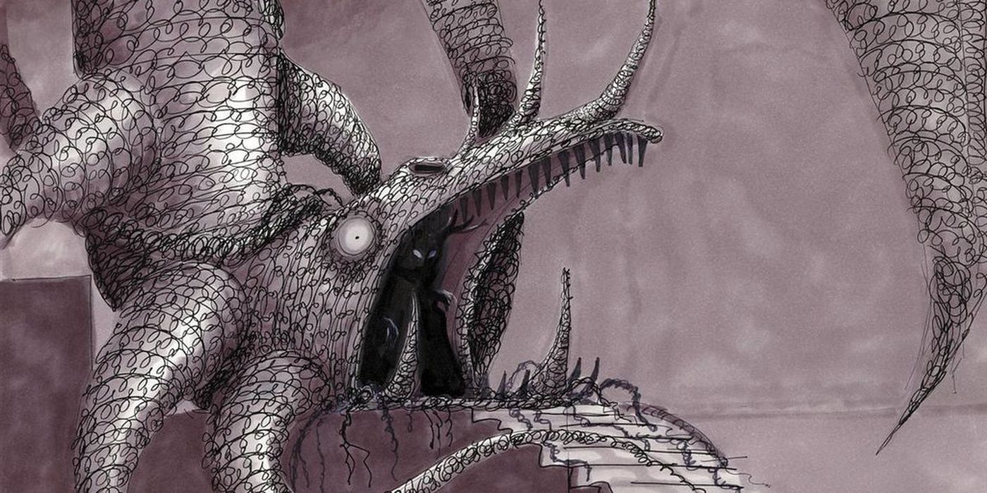
Prolific filmmaker and artist Tim Burton has had a complex history with the Walt Disney Company. From beginning his career as an animator on films like The Fox and the Hound, to his work on Frankenweenie and the recent remake of Dumbo, Burton has always had a twisted style. So imagine our surprise when we learned his sketches for The Black Cauldron were deemed too dark for Disney.
You read that right. Burton's designs were too dark for the darkest Disney movie ever made! Just look at this design for the Horned King's throne room, doesn't this look leaps and bounds better than the stereotypical stone chamber seen in the film? Truly wasted potential here.
6 A Firey Fight
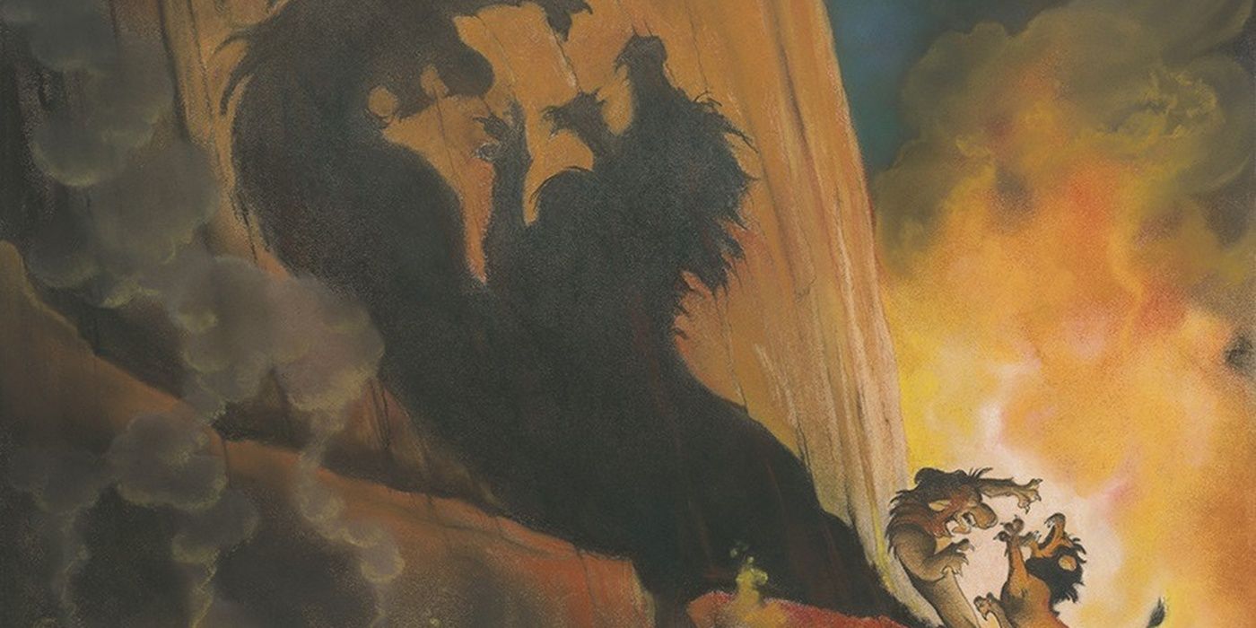
The Lion King is without a doubt the most beautiful traditionally animated film in existence. The sweeping views of the African savannah, the bright vivid colors and hues, and the fluid, crisp animation all come together to bring the film to life. Believe us, we had a lot of pieces to choose from, but this fight sequence by Kevin Yasuda truly stood out.
Yasuda's depiction of Simba and Scar's climactic brawl really blazes off the paper here. The intense shadows and the ominous flames burning behind them definitely steps up and sets the mood perfectly during this last confrontation.
5 Stitch By Sanders
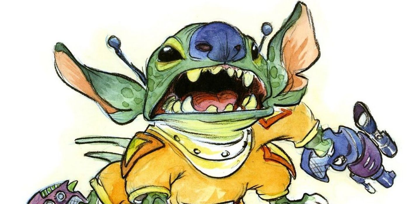
Before he was directing the How to Train Your Dragon series of films, Chris Sanders was a huge Disney mainstay from as early as the '80s. Sanders has animation credits on everything from Muppet Babies to films like Beauty and the Beast, but his most famous creation happens to be a little blue troublemaker named Stitch.
Stitch wasn't always blue and he wasn't always the mischevious bundle of fur and fangs we love today. At one point, Stitch was an escaped space-convict who had to go into hiding on earth to evade galactic law enforcement and a rival gangster. We'd be lying if we said this piece of art didn't give us some serious retro-sci-fi nostalgia, though.
4 Juggling Genie
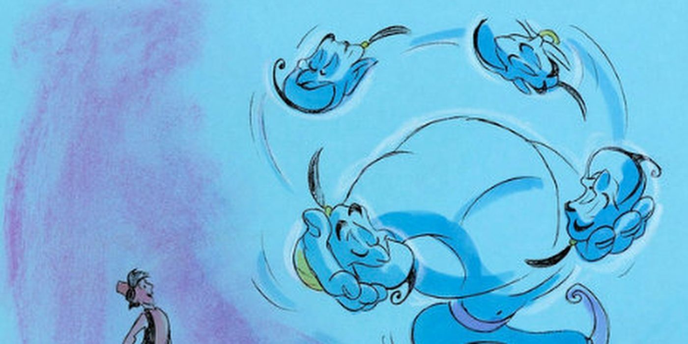
Along with previously mentioned animators like Marc Davis and Chris Sanders, Disney Legend Eric Goldberg is responsible for several different iconic Disney characters like Philotetetes, Louis the Gator, and Maui's tattoo, but his magnum opus under the Disney name has to be the Genie from Aladdin.
Not only did Goldberg work on the Genie in the animation department, but he also worked with the late great Robin Williams to pair the actor's performance with his sketches. This sequence shown above truly captures Goldberg's Hershfield-inspired art style brilliantly pairing with Williams's madcap and manic sense of humor, and the two work together harmoniously.
3 A Familiar Face
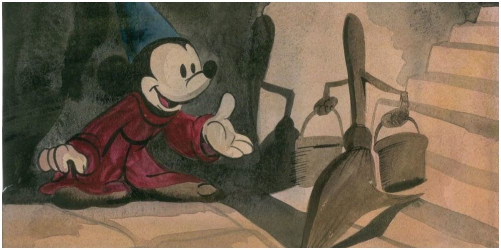
Before his feature-film appearance as the Sorcerer's Apprentice, Mickey Mouse had a very simplistic and recognizable design brought to us by the brilliant minds of Walt Disney and Ub Iwerks. However, the segment featured in Fantasia was Disney's way of bringing Mickey back into the forefront, and the mouse needed a makeover.
Before animator Fred Moore gave us the Mickey we know and love today, there was still an attempt at keeping his more classic design for his magical segment, as shown in the picture above. Though we're particularly fond of the black-eyed look ourselves, we have trouble imagining Mickey without his more expressive final design.
2 Zootopia In Neon
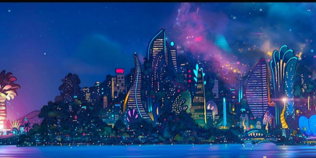
Honestly, we could talk all day about how much we love every single minute detail in Disney's Zootopia, but we'll settle for this beautiful piece of concept art from artist Mathias Lechner. The city of Zootopia itself is absolutely beautiful in broad daylight, but it's the nocturnal side that really knows how to swing.
Zootopia's environments, whether they be the cozy Bunny Burrows or the frigid Tundra Town, have this unnamed quality that makes us simply want to be there. The same can definitely be said for this Starry Night-esque depiction of the thriving cityscape.
1 A Home For Happy Haunts
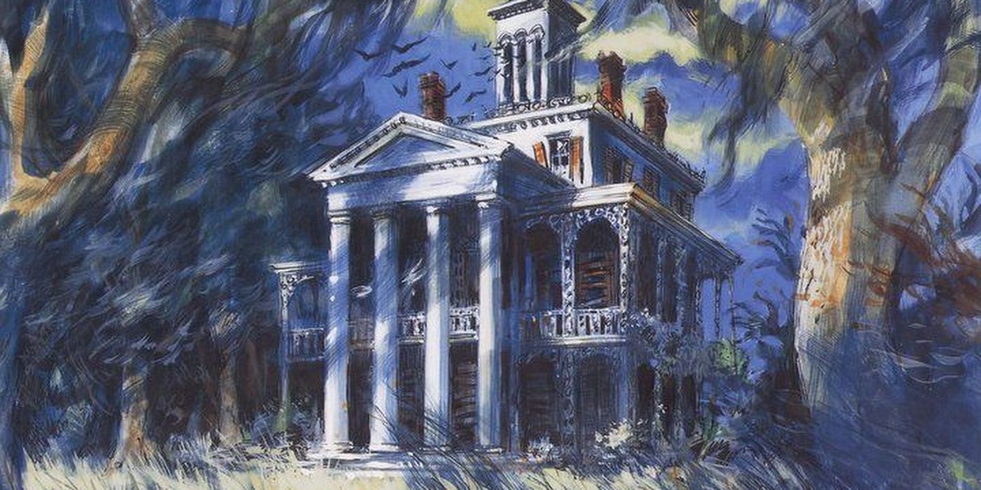
What better way to end than with a piece of art from the Disney Parks? And if we're only going to pick one attraction or ride for our list, it has to be the Haunted Mansion, due to the Imagineers' involvement and dedication to bringing this incredible home for happy haunts to life.
Even from this early design from the original Disneyland attraction, the atmosphere, story, and haunting quality can be felt from the very beginning. With the hand-like skeletal trees, the twittering bats in the tower, and the ghostly wisps of Spanish moss, this piece of art practically screams Haunted Mansion.
from ScreenRant - Feed https://ift.tt/2SKvBXQ


No comments: