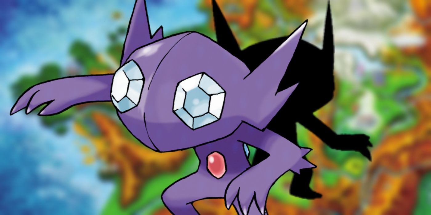
Since the release of Pokémon Red and Blue more than 20 years ago, many of the series' monsters have seen radical redesigns. With the main games moving to 3D graphics after the release of Pokémon X and Y, Game Freak was able to make certain Pokémon look as cool as - or even cooler than - their artwork.
Fans nowadays may be used to 3D Pokémon games, but for many, these 3D Pokémon designs are new. The transition to the newer, high-resolution graphics means players are seeing their favorite Pokémon in their full glory. Seeing the sheer size of a Wailord, for example, or the fury of a Hydreigon for the first time in 3D brings life to Pokémon that 2D designs couldn't.
As the main Pokémon games moved to 3D, designs became more intricate and detailed, allowing game designers to do more with Pokémon character models. While there is still a lot of charm and love in the old 2D designs, many Pokémon look better in 3D. Here are a few Pokémon that became a lot cooler when transitioning from 2D artwork and sprites to 3D models.
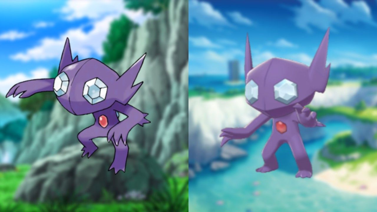
In 2D, Sableye is just a little boring. It's not bad, but it's not great, either. Sableye’s eyes bug out of its head a little in 2D, which can make the whole design feel a little off. The biggest upgrade Sableye receives moving to 3D is its idle animation. Its jerky, haunted animation makes Sableye one of the coolest and creepiest Pokémon to move to a 3D model.
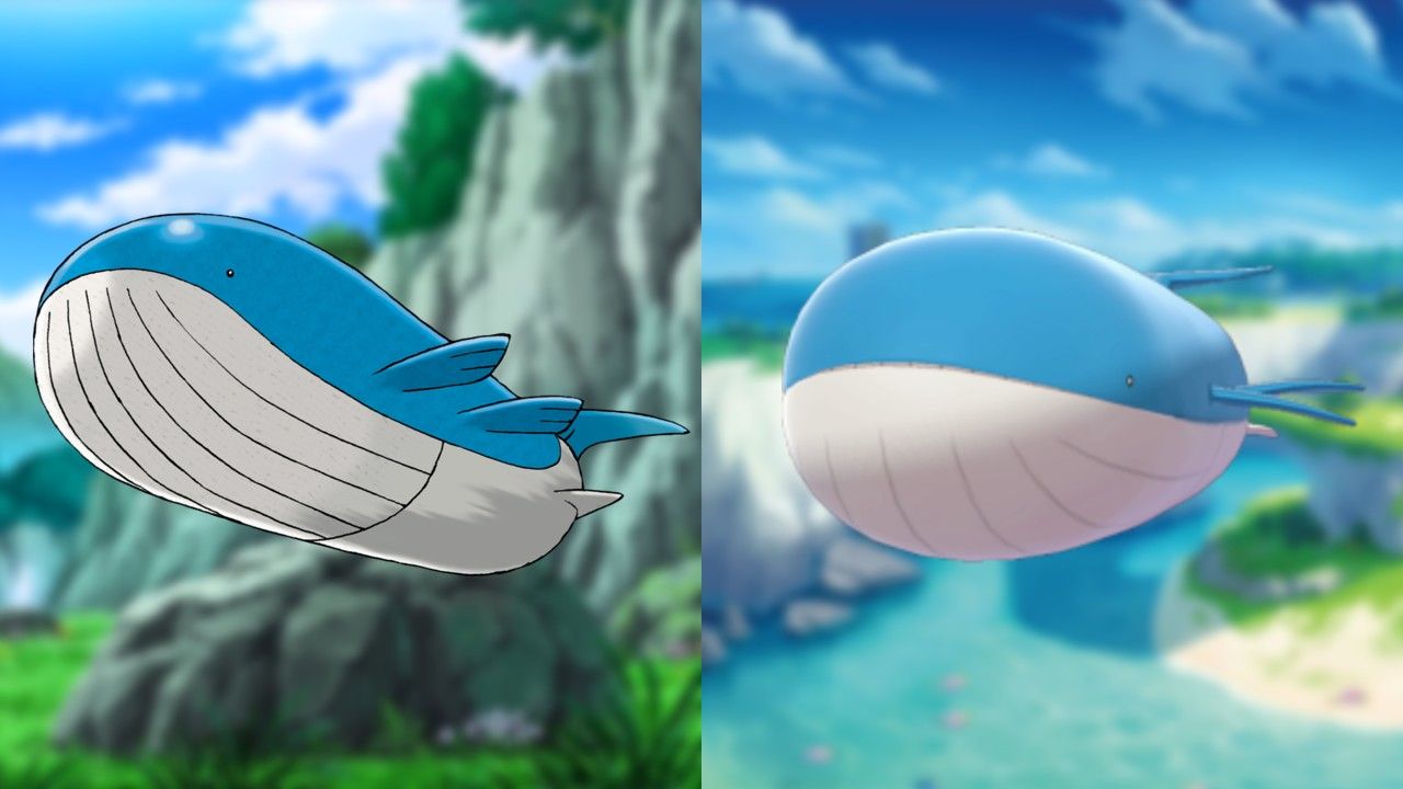
As the largest Pokémon, at least by sheer size, Wailord’s design left a lot to be desired in 2D. With its tiny eyes, weirdly elongated chin, and oddly proportioned fins and tail, Wailord is a goofy Pokémon. Moving to 3D, however, gave Wailord the chance to bask in its chonky glory. Fans can feel the imposing weight Wailord commands, and, when compared to other Pokémon, it makes even the largest foes feel small.
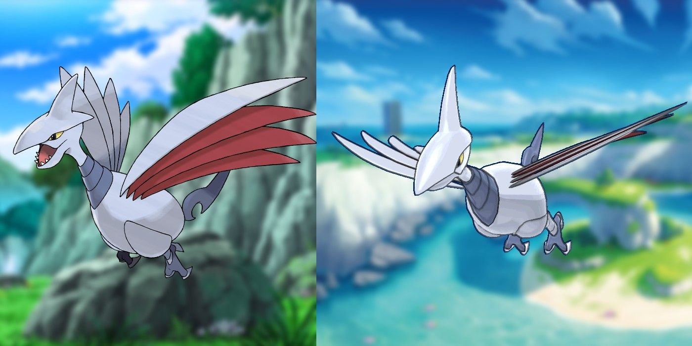
Skarmory's design is a bit of a mess; it's like someone dropped a bunch of swords and they happened to resemble a bird. Thanks to its 3D model, however, this armored bird really comes to life. Skarmory's beak feels more natural in the 3D version - more aerodynamic and less like a giant nose. This Pokémon's biggest change, though, is that its 3D wings look more functional and not just like slabs of sheet metal haphazardly attached to its body.
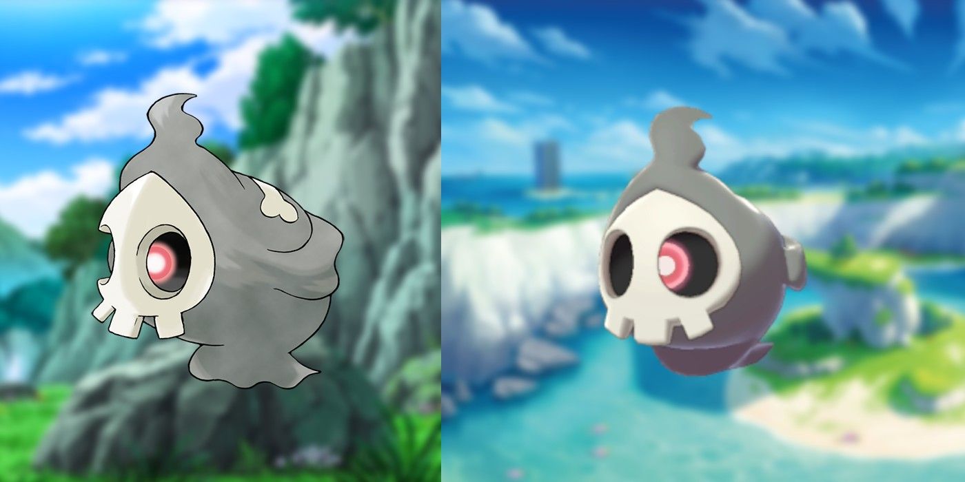
In its 2D design, Duskull has a lot of character. Between the little skull mask and the bone on its back, it's a very well-designed (and cute) Pokémon. Still, it's another Pokémon where the 3D design simply does more for its overall quality. Similar to Sableye, Duskull's animation give it an edge over its 2D design, as the single red eye behind Duskull's mask shifts back and forth, peering through either one of the two sockets of its mask. It's a touch many fans may have missed in this Pokémon's 2D iterations, revealed by its 3D model.
from ScreenRant - Feed https://ift.tt/2M41cnG


No comments: